
In this tutorial, we will explain how to create charts in Excel from basic along with we will provide examples, and a guide to visualize how this work. We will also learn to customize, combine, save graphs, change layouts and style and move a graph.
Apparently, when the workbook contains a lot of data it seems hard to analyze and interpret. So these charts are very useful to display workbooks graphically, hence it easy to visualize trends, sales and comparisons.
Here we go we’ll define what chart is…
What is Charts In Excel?
A chart also known as graph is a graphical explanation of numeric data which uses bars, lines, columns and etc. This represents a bunch of information wherein it is difficult to interpret the relationships and comparison of data without visuals.
Furthermore, Microsoft Excel allows making a lot of charts or graphs name these are column, line, pie, bar and so on. Therefore below are the following types of charts in Excel along with its figure and description.
Types of charts in Excel
| Type of Charts | Description |
 Column Column | Column charts are to display data that changes over a period of time. This compares the data vertically side by side and is represented as a vertical bar. If the value in your data has different series it is defined with a different color. |
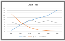 Line Line | Line charts are used to visualize trends over time wherein the value is plotted as dot and connected with a line to the next value. Multiple items are plotted using different lines. |
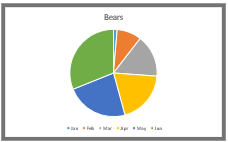 Pie Pie | Pie charts are practical to use in visualizing values as percentage values as a whole. This is presented in different colors on every value. It is limited to eight sections. |
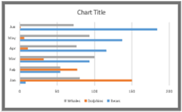 Bar Bar | Bar charts are similar to column charts however information is displayed horizontally unlike column charts its illustrated as vertical bars. |
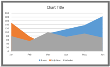 Area Area | Area charts are identical to line charts however the beneath areas atr filled with colors. |
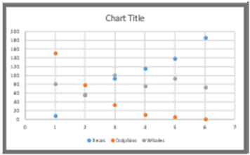 XY(Scatter) XY(Scatter) | Scatter charts are utilized to plot clusters of values using single points. It is used to show the negative and positive relationship between data. Thus using these charts multiple items can be plotted using different colored points or different point symbols. |
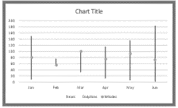 Stock Stock | Stock charts are used to determine the fluctuation of stock prices in a given period. It is effective for reporting the fluctuation of stock prices for a certain day if it is low, high or a closing point. |
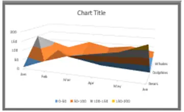 Surface Surface | A surface chart is used to plot sets of values in three-dimensional surfaces. Other than that it is practical in finding optimum combinations between two sets of data. |
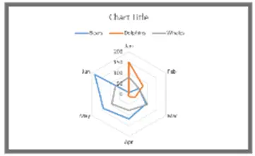 Radar Radar | Radar charts compare the aggregate values of multiple data series. |
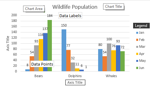
Additionally, charts have a lot of elements some are basically displayed default while others are required to be add chart elements your charts it depends on what you prefer.
- Chart Area
- Chart Title
- Plot Area
- Horizontal Axis
- Vertical Axis
- Data Labels
- Legends
- Data points
- Axis Titles
- Trendline
The Importance of Charts
Utilizing charts in your workbook is significant in the following:
- It allows you to easily interpret data compared to ranges of cells only
- It gives visualization graphically.
- It is convenient to analyze data preferably the trends and sales of the business industry.
You can also use conditional formatting as an alternative to this function.
How to Create Charts in Excel
Time needed: 3 minutes
Creating charts in Excel speaks enormous numerical data in worksheets. Now, here are the steps on how to create your charts.
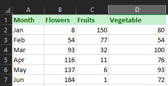
- Enter data or open your worksheet containing the needed data.
In this case enter your data if you are doing it manually, however if you have already just export the file. In our data we have the Shop sales data.
- Select desired graphs or charts.
Locate where is the graphs option as well as the graph you want to use. Click Insert Tab and you will the group of charts.
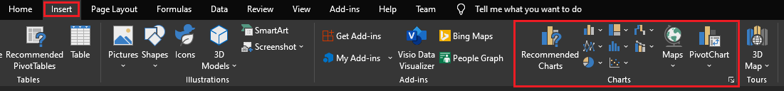
- Highlight data and go to Insert Tab and Select the chart.
Now as you highlight the data Click the insert tab and go to the Charts group, where you can easily pick a graph.
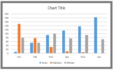
In our example, we chose a column chart.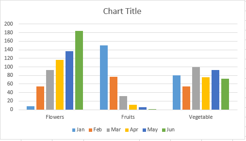
You can view all charts on the dropdown menu just click the recommended charts button
in the charts tab then the dialog box appears.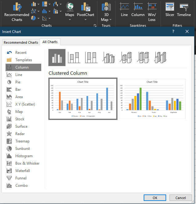
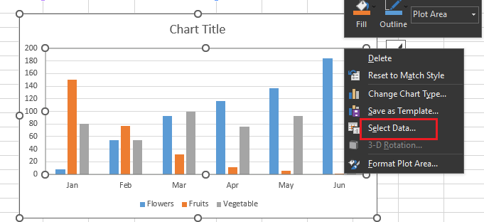
- Switch axis data if required.
This time to switch what displays on the X and Y axis first right click the graph and click Select Data, hence the diag box will appear.
Click Switch Row/Column this will change the arrangement see how it changes below. When finished, click OK at the botton.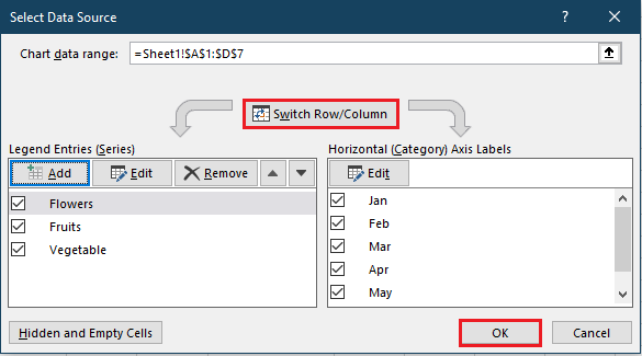
The result is shown below: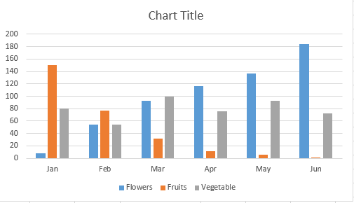
- Modify data layout, colors and format.
In changing the layout and legends just click the bar graph and click the Chart Design tab. This you can customize your chart title, axis and legends.
In our example below, we select style 4 on the option where displayed bar colors and legends are below the chart.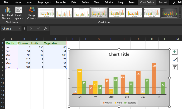
Additionally, if you want to format on legend select Format Legend Entry on the sidebar. There you can alter the fill color which also changes the color of the columns. Thus you can also format other elements of charts. - Adjust axis labels and legends.
To increase the size of your graph’s labels, click on them individually and, instead of revealing a new Format window, click back into the Home tab in the top navigation bar of Excel.
Then, use the font type and size dropdown fields to expand or shrink your chart’s legend and axis labels to your liking. - Change y-axis measurement.
In changing the y-axis measurement just click the y-axis percentage on the chart. Then the format axis window will display. Now you can decide if you would like to display units on the Axis option tab or change it even the y-axis display percentage or no decimal places.
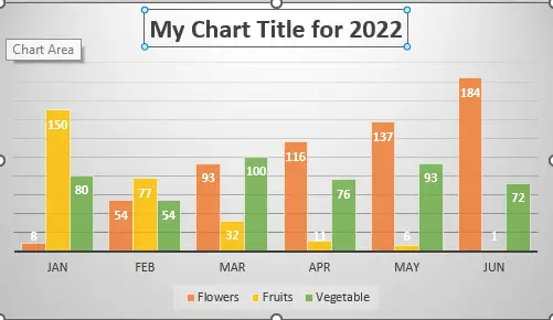
- Make Title graph
This task is way easier and I think you can figure out now how to use it. To make it clear, as you created the chart title will appear similarly. It depends on what version you are using. Further to change the title label click the “Chart title” after the cursor will appear you can create your preferred title.
- Export graph or chart
After setting up the chart suits to your liking. Hence you can save it without using a screenshot but save as an image. This will result in a clearer image when you need to insert any data.
Conclusion
In conclusion, this article on how to create chart excel demonstrated it is a powerful tool for visualizing graphically the bunch of data. In addition to that Excel provides many types of charts that will meet the need of the interpretation of data.
I hope you have gained learnings from this article. Feel free to leave your thoughts about this topic in the comment section below.
Thank you for reading 🙂