In this tutorial, we are going to learn how to add axis titles to charts in Excel. Aside from that, we will also learn how to format axis titles.
As we all know, charts commonly have two axes. These are the x and y axes, or the horizontal and vertical axes. And, in this tutorial, we are going to use a scatter plot or XY chart as an example to show you how to add axis titles.
Without further ado, let’s go directly to our tutorial.
How to add Axis Titles in Excel (Tutorial)
Time needed: 1 minute
Here’s a step-by-step tutorial on how to add axis titles to a scatter chart in Excel.
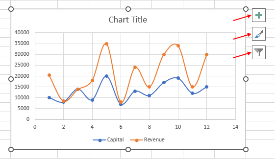
- Click the chart.
Once you have your chart, click anywhere in the chart, and then you’ll see three buttons to the right. These buttons are the chart elements, chart styles, and chart filters.
- Select the chart elements.
The next thing we do is select the plus sign, which is called the chart elements. After clicking the chart element, you’ll be taken to the chart’s elements, where you can add chart element.
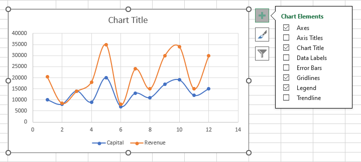
- Click the checkbox next to “Axis Titles.”
After selecting the chart elements, click the checkbox next to the axis titles. Then, you’ll see this outcome:
Note: It is your choice if you only want to display the primary vertical (vertical axis title) or the primary horizontal (horizontal axis title).
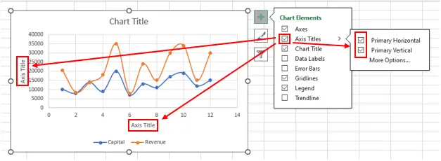
Tip: To change the axis labels, simply click it (the axis title text box), double click, and change the text.Format Axis Title
As stated at the beginning of this article, you will learn in this tutorial not only how to add title axis but also how to format an axis title in Excel.
In formatting the axis title, you can control what design you want your axis titles to have. You can add a background design to it, add a border, put effects on it, change its size, and change its other properties.
Here’s a step-by-step guide on how to format an axis title.
1. Right-click the axis title.
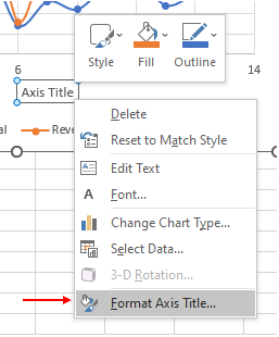
The first thing you do is right-click the axis title, and then you’ll see formatting options. Select the “format axis title” below.
Note: There’s also another way to format the axis title. Just click the “more options” button in the chart elements tab, under the axis titles.
See the sample picture above (the third step in how to add an axis title).
2. Choose which you would like to format.
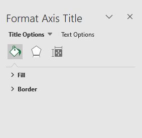
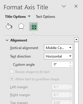
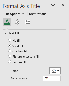
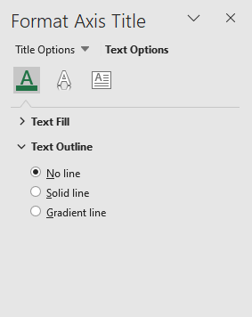
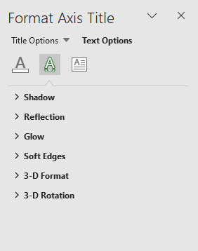
After clicking the “format axis title,” this is what you’ll see. There, you can choose what you would like to format in your title.
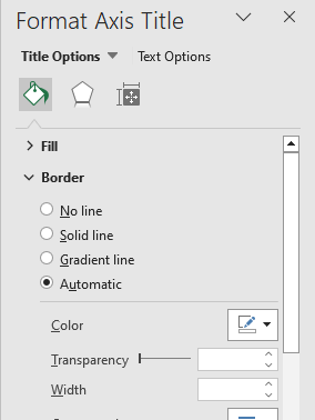
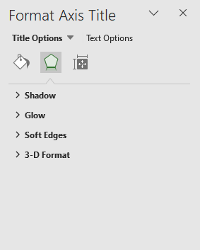
Note: See the sample pictures below to see what you can format.Title Options
1. Fill & Line

2. Effects and Size & Properties
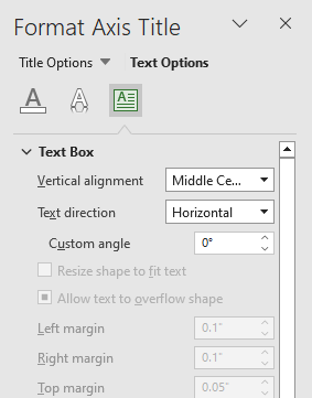
Text Options
1. Text Fill & Outline
2. Text Effects and Textbox
Conclusion
In conclusion, this tutorial is a key to making our work “adding axis titles to our graphs” easier and more effective. As a matter of course, we can do this by using Excel.
I think that’s it for this tutorial. I hope you’ve learned something from this. If you have any questions, please leave a comment below, and for more educational contents, visit our website.
Thank you for reading.

Elijah Galero
Programmer & Technical Writer at PIES IT Solution
Elijah Galero is a programmer and writer at PIES IT Solution, author of 175+ tutorials at itsourcecode.com. Specializes in Python error debugging (AttributeError, TypeError, ModuleNotFoundError), Python programming tutorials, and Microsoft Excel how-to guides for BSIT students and productivity learners.
Expertise: Python · Python Errors · Python AttributeError · Python TypeError · ModuleNotFoundError · MS Excel · MS PowerPoint · View all posts by Elijah Galero →