What is a Gantt chart used for? In this tutorial, we will talk through how to create or make a Gantt chart in Excel. In MS Excel, there’s no built-in Gantt chart option.
However, you can easily create a Gantt chart in Excel using the bar graph functionality and a bit of configuration.
If you are struggling right now with your deadlines because of a lack of planning for your workload, then you need a proper plan. A Gantt chart in Excel is the key.
What is Gantt Chart?
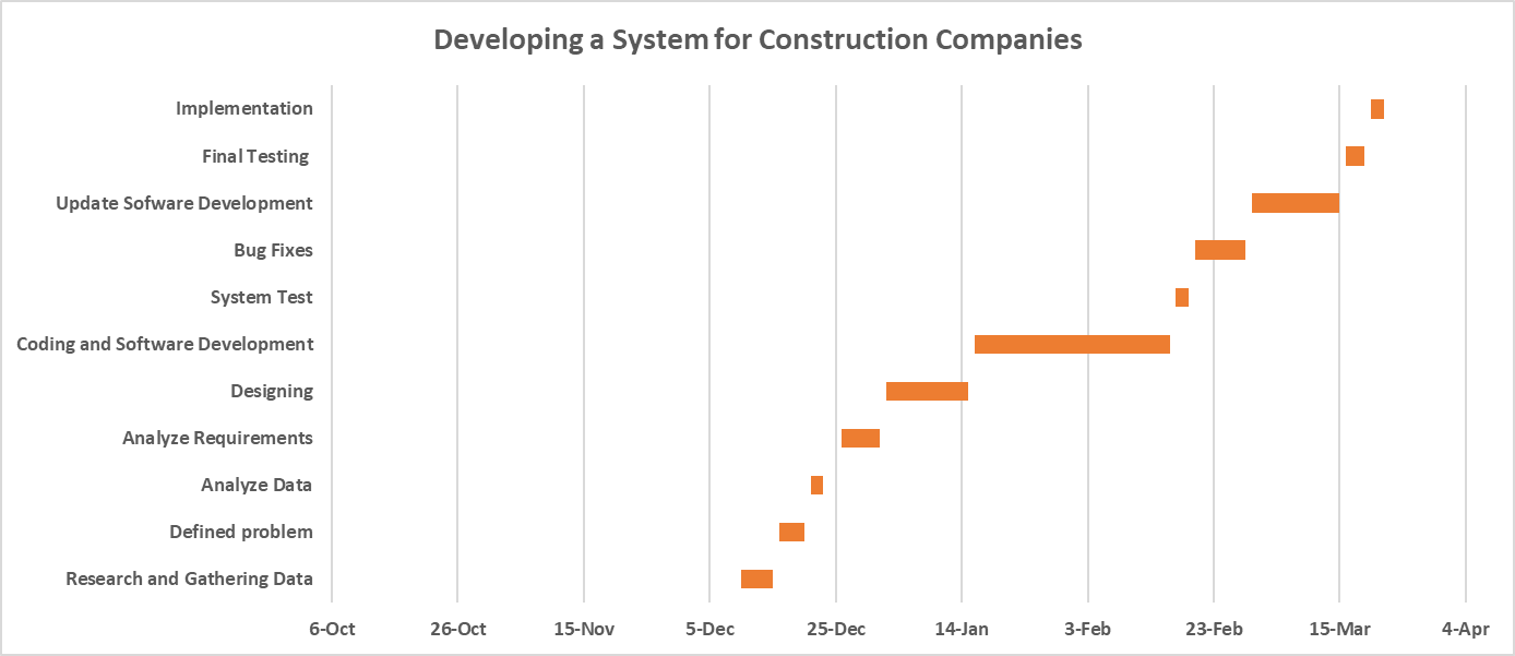
A Gantt chart is a chart that aids in project task scheduling in the form of horizontal bar charts to visualize your project tasks. The bar chart depicts the duration of each task in the project, allowing you to see when to start and when to finish each task.
In addition to that, a Gantt chart shows the breakdown structure of the project, which includes the task description, start date, end date, and duration. In this way, it helps you to plan and track your deadlines.
It is referred to as a project management tool because it allows you to visualize the timeline of your project. Apart from that, this chart is not just about task scheduling; it also helps you track your progress.
How to make a Gantt chart in Excel
Execute the following steps in order to create a Gantt chart in Excel:
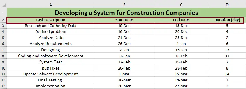
1. Create a list of your project table in Excel
To start with, you need to breakdown the entire project’s information into an Excel spreadsheet. You need to list each task in a separate row and arrange your project plan. Your project plan includes a project task description, a start date, an end date, and a duration.
- The task description is the title of the task that you need to perform.
- The start date is the date on which you begin working on your task.
- The end date is the date on which you finish your task.
- The duration is the number of days that it takes you to complete your task.
If you don’t want to count the duration by hand, you can use this formula to calculate the duration and automatically fill in those cells.
- End date-Start date = Duration
- End date-Start date + 1 = Duration
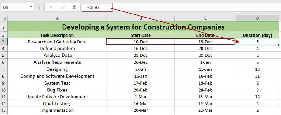
On the other hand, you can find your End date by using this formula:
- Start date + Duration = End date
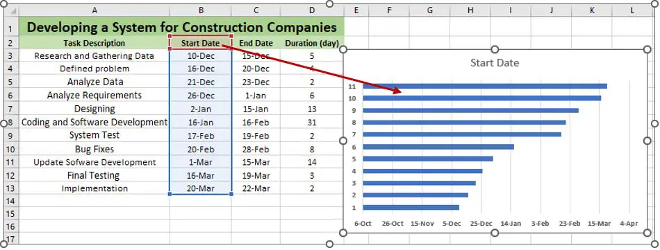
2. Add an Excel bar chart by setting it up as a stacked bar chart.
Simply follow these steps to learn how to create or make a Gantt chart in Excel by adding a bar chart to your worksheet.
- Highlight or select the data series “start date”.
- Click “Insert” tab.
- Click “Insert Column” or “Bar Chart.”
- Then choose “Stacked Bar” from the dropdown menu under “2-D Bar” section.
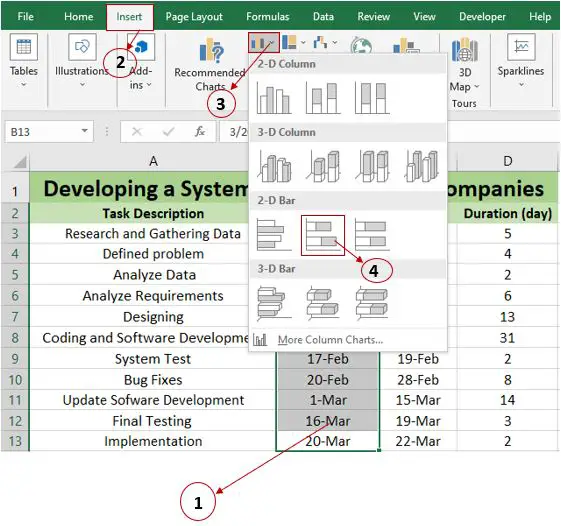
After that, a stacked bar was added to your worksheet, as you can see below.
Note: In other Gantt Chart tutorials in Excel, they recommend creating an empty bar chart first and then adding the data. This kind of step is great because MS Excel will add one data series to the chart automatically.
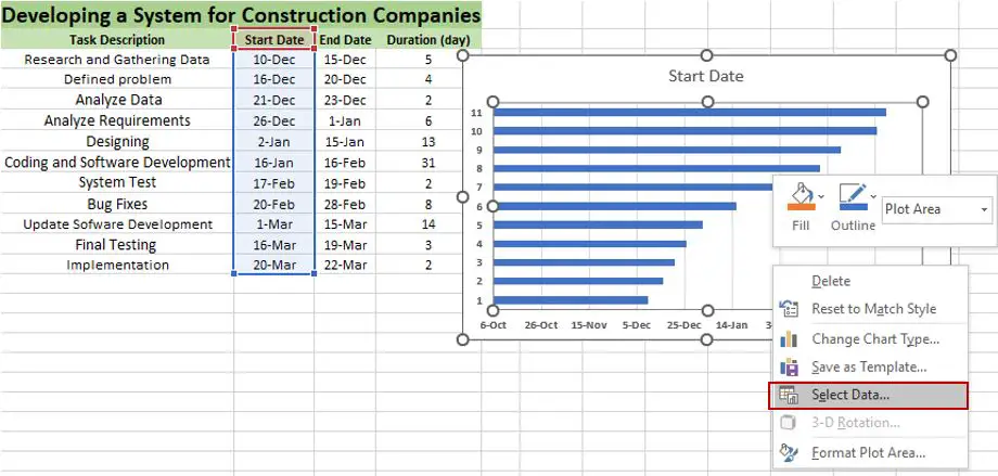
3. Adding a duration data to the chart
For the third procedure, you need to add another series to your Excel in order to reflect each task’s duration. Just execute the following:
1. Right-click the chart and click “Select Data.” Then the “Select Data Source” dialog box will pop up.
2. In the “Select Data Source” dialog box, click “Add,” and “Edit Series” will appear.
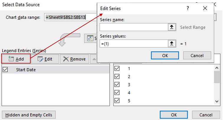
3. In the Edit Series window, type “duration” in the Series name field. Then, in “Series values,” click first on the text box and erase the default data in it. After that, highlight all the data in the column for duration, and if you’re done, click “OK.”
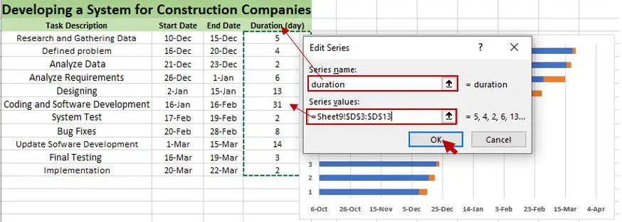
4. After you click the “OK” button, you’ll return to the “Select Data Source” window. You just have to click “OK,” and the duration data will be added to your Gantt chart in Excel.
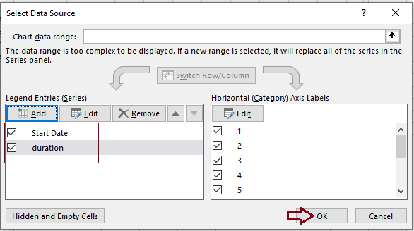
5. The result should be like this:
4. Adding a task description to the Gantt chart
This time you need to replace the days on the left side to get your chart to reflect the task description instead of row numbers.
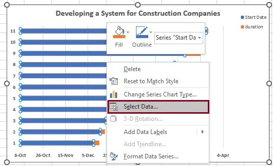
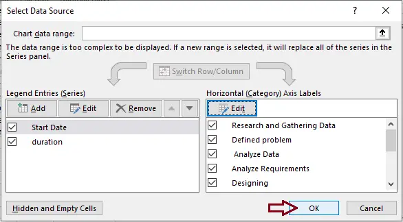
1. Right-click the area with the blue and orange bars on the chart and select “Select Data.”
2. In “Select Data Source,” click “Start Date,” and then click the Edit button on the right pane, below “Horizontal (Category) Axis Labels,” and click “OK.”
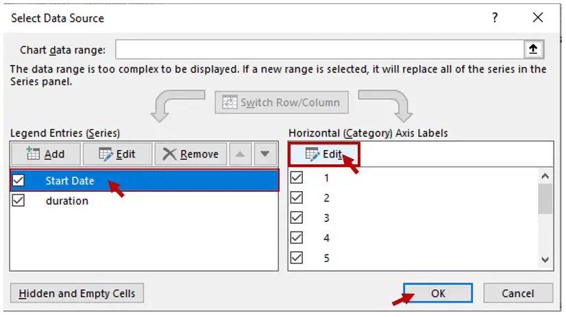
3. After you click “OK,” the “Axis Labels” window will appear, and you need to select all the data under “Task Description.” If you’re done, click “OK.”
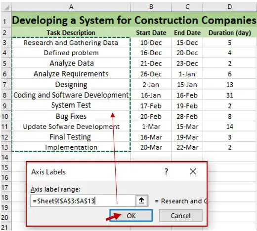
4. After you click “OK,” “Select Data Source” will pop out, and then you just have to click “OK.”
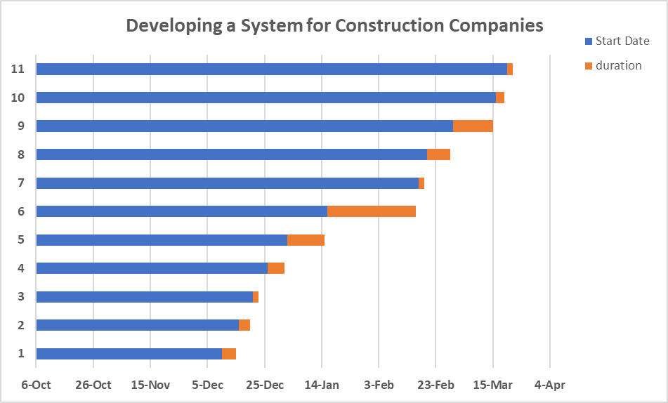
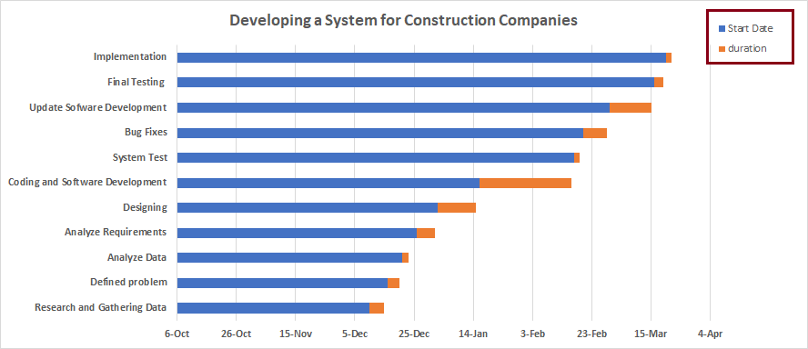
5. Your Gantt chart will look like this, and the next step is to delete the start date and duration on the left side in order to make it look professional.
5. Formatting the bar chart to look like a Gantt chart
Now, you need to transform your stacked bar chart into a visual Gantt chart. You need to hide the blue bars, yet the orange bar will remain.
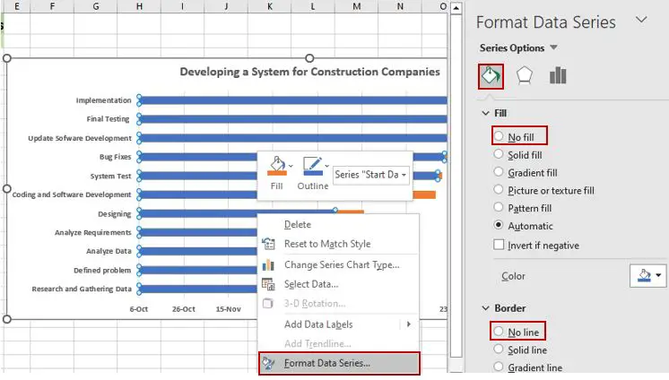
1. Click any of the blue bars in your Gantt chart, right-click, and choose “Format Data Series” from the context menu in the “Format Data Series” window. Choose “Fill & Line” and then click “No Fill.” After that, click “No line” under “Border.”
2. The result would be like this; you don’t have to worry about its look; we’ll fix it.
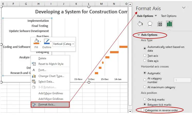
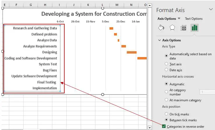
3. As you can see, the task description has been listed in reverse order. We were going to fix it now. Click the “Task Description” in the chart and right-click (you can also double-click), then select “Format Axis.” In the Format Axis, check the “Categories in reverse order” option below “Axis Options.”
4. Your chart will look like this in the picture below; the task descriptions are now arranged in a proper order in the Gantt chart.
6. Finalize the design of your Gantt chart in Excel
Your Gantt chart in Excel is almost finished; you just need to design it further and then optimize it to make it more visually appealing.
Kindly follow the following guide to make your Gantt chart more presentable and professional.
1. You need to remove the white space on the left side of your Gantt chart in order for your tasks to be closer to the vertical axis. The white space was originally for the blue bars that we hide.
a. Double-click the dates above the task bar of your chart, and then “Format Axis” will display on the right side of your Excel spreadsheet. Under “Bounds” in the “Axis Options,” you can change the current number of “Minimum” in the textbox.
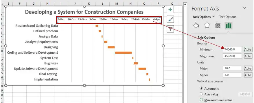
Note: You can reset the “minimum” anytime by clicking the “reset” button to restore its original number. To allow you to experiment with various settings until you find one that makes your Gantt chart look good.
b. By doing so, it will make your Gantt chart tasks closer to the vertical axis. In our case, we change the “Minimum” into (44905.0) and also we change the “Major” from (20.0) to (25.0) under “Units.”
Why are we doing this? It is because we adjusted the spaces between the dates listed above on the horizontal axis.
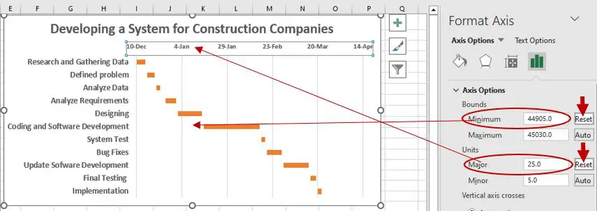
Note: By changing the “Major” will enlarge the space between each date and it will lessen the number of dates of your Gantt chart.
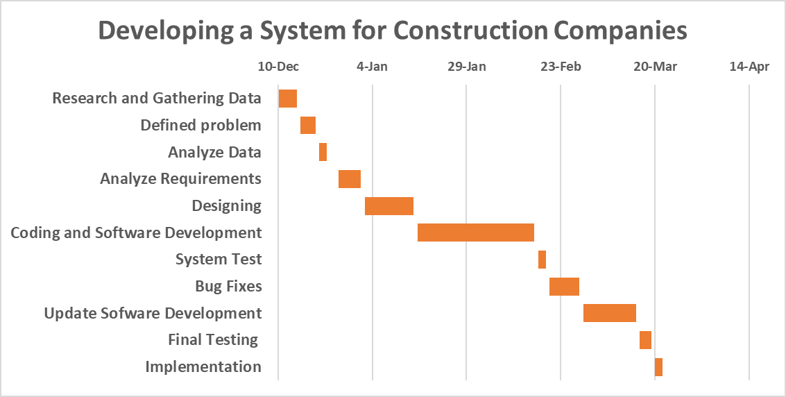
c. Finally, we are done, and now here’s the result. In our case, we make the title, task descriptions, and date bold so you can see them clearly.
Note: You can change the design of your Gant chart at any time by changing the thickness, fill color, border color, shadow, and applying the 3-D format.
Tip: You just have to double-click the bar in your chart, and then it will show “Format Data Series.” You can experiment with the design you want in there.
Conclusion
With the help of this tutorial, you can now create a simple Gantt chart in Excel. If you’re finally done creating your Gantt chart with this simple guide, well, that sounds good.
You may now explore it further to make the visualization of your Gantt chart look good. I hope this tutorial on how to make or create a Gantt chart in Excel totally gives you an idea on how to create one.
Thank you very much for continuing to read until the end of this article. In case you have more questions, feel free to comment. You can also visit our website for additional information.

Caren Bautista
Technical Writer at PIES IT Solution
Responsible for crafting clear, well-structured, and beginner-friendly content across the platform. Handles the writing, proofreading, and editorial review of tutorials, guides, and documentation to ensure every article is accurate, readable, and easy to follow.
Expertise: Technical Writing · Content Creation · Documentation · Editorial Writing · JavaScript · TypeScript · Python · Python Errors · HTTP Errors · MS Excel · View all posts by Caren Bautista →