In this tutorial, we will discuss what a clustered column chart is in Excel, how to create it, and how to use it. Of course, we will guide you from start to finish with examples.
In Excel, there are a lot of chart types you may use; however, you must first decide which chart is appropriate for your data.
Are you still perplexed as to what a clustered column chart is? Continue reading because today you’ll learn how to create a clustered column chart in Excel.
First, we will define the column chart before we proceed into the clustered column chart. So, here we go!
What is Column Chart?
A column chart is used to represent or display data and to compare values in different categories by using vertical bar charts. It is the simplest and most commonly used chart in Excel.
The reason is that, it is easy to create and easy to understand. For example, by simply looking at the column chart. You’ll easily identify which data set is the highest or the lowest because of length of columns that shows.
Let’s take a look at this example of a simple column chart in Excel.
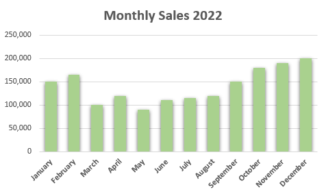
Note: A column chart contains vertical columns, whereas a chart with horizontal columns is called a bar chart.
What is a Clustered Column Chart?
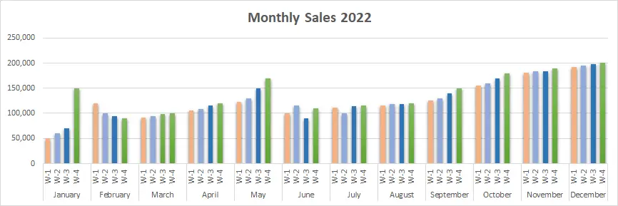
A clustered column chart is a column chart that shows multiple data series virtually in vertical columns to compare data with each other. It show direct comparisons of data series with the same axis labels.
In addition to that, it is used if there are a multiple categories and sub-categories of data set. It is often used to compare sales and other data that continues to change over time.
Even though these charts were very simple to create, they are also visually complex to analyze as the categories increase.
Note: Do not use 3-D effects in the clustered chart.
Pros and Cons of clustered column chart
Pros
- Easy to create and interpret.
- It is easy to compare multiple data series for each category.
Cons
- It is difficult to compare if there are many columns.
- It doesn’t work well for data that is not evenly distributed.
- As the series of data keeps growing, it may become visually difficult to understand and compare.
How to create a Clustered Column Chart in Excel
Do you still have a question about how to make a column chart after reading the explanation and example?
Well, problem no more, as here is a step-by-step guide on how to create a clustered column chart in Excel. It is effortless, easy to use, and, of course, easy to understand.
Time needed: 1 minute
To make a column clustered chart, follow these steps:
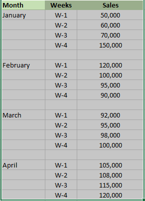
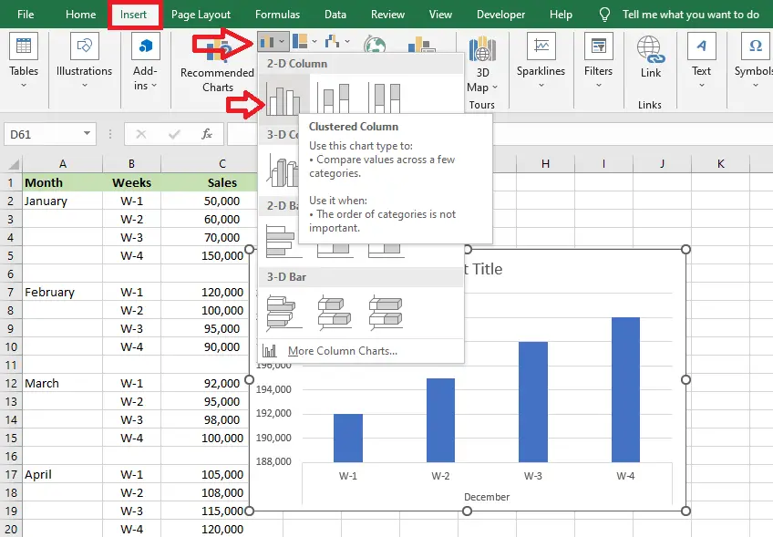
- First, you have to open your Excel spreadsheet, and you must prepare the data set as shown below. Then select the data that you want to graph.
Here we have the month, weeks, and sales. This means we have to compare the sales from January to December.

- Second, after you select the data, you must go to “Insert,” next select “Column Chart,” and then choose “clustered column chart.”
It automatically show your chart.

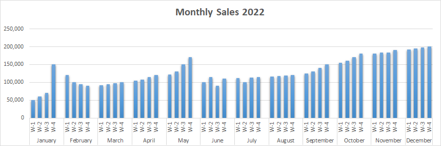
- After you inserted the chart it will look like this.
Your clustered column chart will appear automatically with your data.

Editing Chart
If you don’t like the default Excel chart type, you can customize it, but if you’re okay with it, that’s fine. You don’t have to edit your chart.
You can change the color, as you can see in the picture above. Also, you can change the fonts and other important details.
Follow these tips.
- Select the chart
- Click the second icon (the paintbrush), which is the chart style below the plus sign icon.
- Then, select the Color option. It will show a drop-down menu of color palettes.
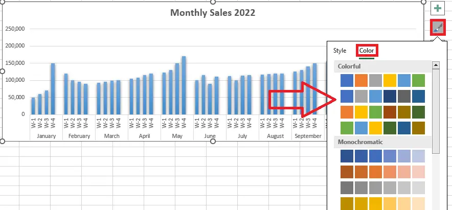
4. After you have chosen the right palette for your chart, you just have to click the palette.
Therefore, the clustered chart look like this.
Note: We customized this picture above by clicking each line to change its color.
Conclusion
In conclusion, this article is entitled “How to Create a Clustered Column Chart in Excel with Example.” Here we discuss column chart and clustered column chart, its steps-by-steps and samples.
Furthermore, it will be a useful tool or tutorial for visually comparing data that continues to change over time.
Thank you very much for continuing to read until the end of this article. In case you have more questions, just visit our website for additional information.

Caren Bautista
Technical Writer at PIES IT Solution
Responsible for crafting clear, well-structured, and beginner-friendly content across the platform. Handles the writing, proofreading, and editorial review of tutorials, guides, and documentation to ensure every article is accurate, readable, and easy to follow.
Expertise: Technical Writing · Content Creation · Documentation · Editorial Writing · JavaScript · TypeScript · Python · Python Errors · HTTP Errors · MS Excel · View all posts by Caren Bautista →