In this tutorial, we’ll hand you the key on how to add a trendline or trend line in excel. Aside from that, you’ll also learn to format the trendline in Excel with a simple and easy tutorial.
Excel is a powerful tool that is best used for data visualization and analysis.
When you want to visualize the trends in your data, adding a trendline to your chart is the best option to use. The trendline is an invaluable tool to help interpret data and add meaning to your findings.
What is a Trendline In Excel?
A trendline is an analytical tool, either a curved or straight line in a chart, that displays the general trends or overall direction of the data. Also referred to as a “line of best fit,” that is easy to use.
Furthermore, it is the visual representation of data movements over time or any time frame related between two variables. On the other hand, it can be used to forecast trends.
It indicates the direction and speed of progress, and its appearance is similar to a line chart. However, it does not connect to the actual data points as what we see in line chart.
How to add a Trendline in Excel?
If you don’t have a chart, you can create one. If you don’t know how to do it, follow the following step-by-step guide.
Time needed: 3 minutes
This example will teach you how to add a trendline to a chart in Excel.
- Open your Excel.
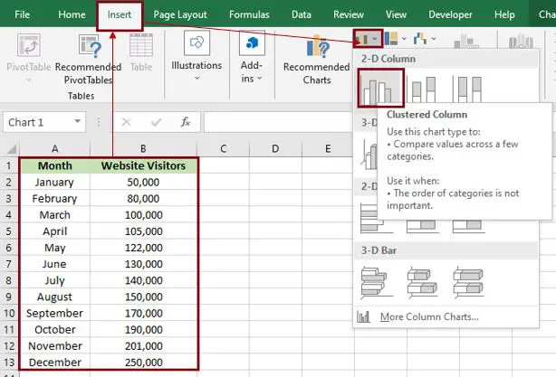
Input your data, then highlight or select all the data you want to display in the chart.
Click the “Insert” tab. In the charts group, click “Insert column or bar graph.”
It will automatically display the result.
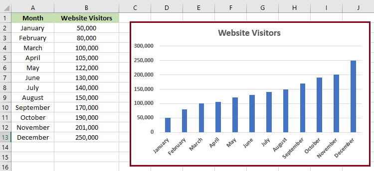
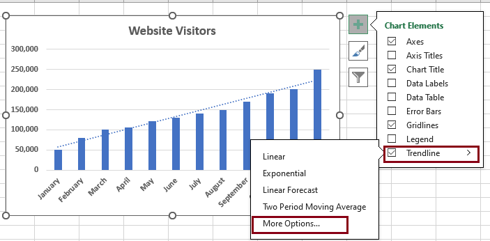
- Select the chart you would like to add a trendline.
Select the chart by clicking it; after that, click the “plus (+)” icon that appears to the right of the chart.

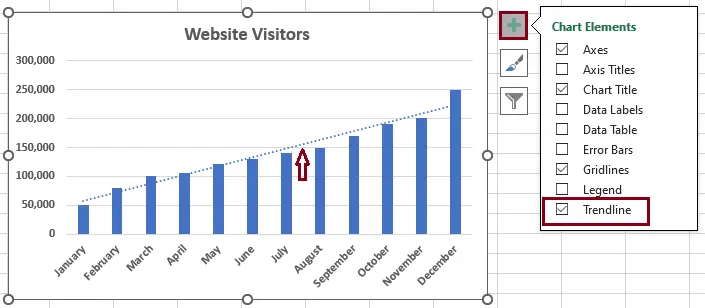
- Select the “trendline.”
In the “Chart Elements” menu that appears, click the checkbox “Trendline.” Once you check the trendline, it will appear on your chart.
The trend line will be inserted by default. If you want to change it, enter Trend line, and a submenu with several lines will appear.
- If you want to format your chart. Click the arrow next to “Trendline,” and then click “More Options.”
It will display the Format Trendline pane, where you can switch to the Trendline Options tab, where you can see all the trend line types available in Excel and choose the one you want.

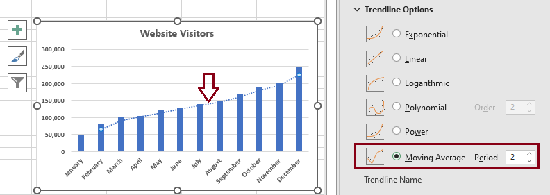
- Result
The default linear trendline will be pre-selected automatically. You can select other trendline types. Make sure that if you want another type of trendline, you first uncheck the trendline in the chart elements because it will double the line of your chart.
However, if you didn’t check the trendline and then directly clicked “More Options,” it was fine.
In this example, we use a moving average rather than a linear one.
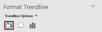
How to format a trendline in Excel
In order to make your graph even more understandable and easily interpreted, you may change the default appearance of your trendline.
1. On the Format Trendline tab, in the Current Selection group, select the Fill & Line.
2. After you select the “Fill & Line” tab, you can choose the color, width, and dash type for your trendline. For example, you can change the dashed line into a solid line and have more options.
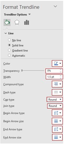
Note: Modify your trendline so that it suits your chart.
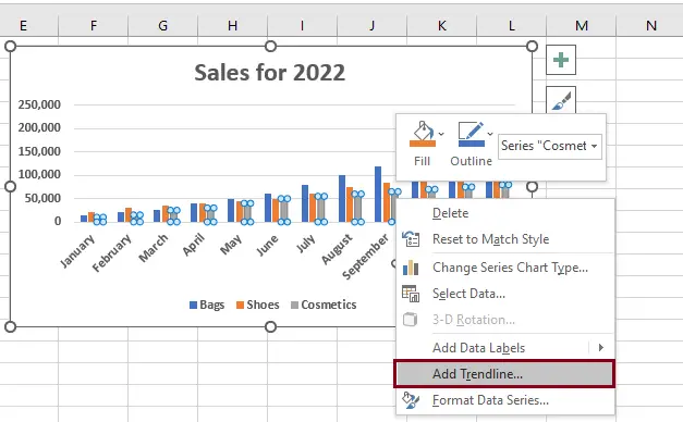
How to insert multiple trendlines in the same chart
We can add multiple trendlines to a chart. Here’s how to put a trendline on a chart with two or more data series:
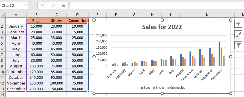
We have here an example of sales for 2022.
1. Right-click the data points of bags (the blue ones in this example) and click “Add Trendline” from the context menu:
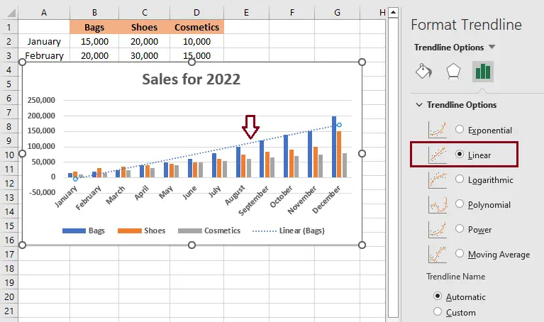
2. It will display the Trendline Options tab under Format Trendline, where you can choose your line type.
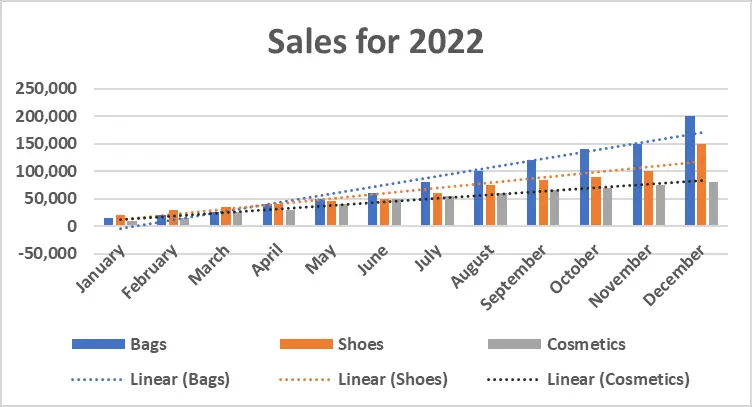
3. As a result, each data series in this example has its own trendline for its matching color, but here we just darken the color gray into dark gray in order to make it more visible.
Conclusion
With this tutorial on how to add a trendline or trend line in Excel, using Excel will be much easier, and it’s not time-consuming. Users can also create graphs and add trend lines to show the values of each data series.
Even if they don’t know how to use them, users can now identify and learn about the specific tools for adding a trend line to the chart.
Thank you very much for continuing to read until the end of this article. In case you have more questions, feel free to comment. You can also visit our website for additional information.

Caren Bautista
Technical Writer at PIES IT Solution
Responsible for crafting clear, well-structured, and beginner-friendly content across the platform. Handles the writing, proofreading, and editorial review of tutorials, guides, and documentation to ensure every article is accurate, readable, and easy to follow.
Expertise: Technical Writing · Content Creation · Documentation · Editorial Writing · JavaScript · TypeScript · Python · Python Errors · HTTP Errors · MS Excel · View all posts by Caren Bautista →