
In this tutorial, we will demonstrate how to make or create a line chart in Excel with an example. Excel helps us make our workbook much easier and better.
Do you want to present your data as a line chart? Yet, you don’t know how to create one. Stop worrying because we will guide you from scratch to the end, so bear with us in this tutorial.
What is Line chart?
A line chart is a type of chart that is used to present data by using several points connected by a continuous straight line. Also, it is called a line plot or line graph.
Line charts, in a nutshell, are used to display trend graphs over time. It is mostly used by investors, traders, and businessmen because it displays a visual representation of how the data value has changed over time.
The horizontal axis shows changes in value over time, whereas the vertical axis shows values for the metric along the progression. Minutes, hours, days, months, or years are usually on the horizontal axis, also known as the (x-axis), while the daily or monthly earnings are on the vertical axis, or the (y-axis).
In addition to that, line charts are usually used to track the values that change over short and long periods.
Let’s see an example of a line chart below.
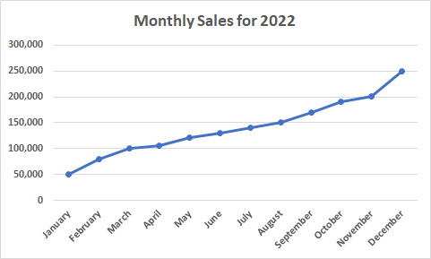
The line chart above shows the monthly sales for 2022; as you can see from left to right, points connect the monthly sales. We can easily identify from the general slope of the line and its vertical positions that the sales in January started at 50,000 and are continuously improving or increasing until December.
Remember: Charts and graphs are most likely the same. Graphs are a numerical representation of a data set that show the relationship between numbers and how one affects another. A line graph is used to show how things change over time.
Meanwhile, a line chart in Excel is created to display trend graphs over time as the visual representation of categories.
How to create a line chart in Excel
Line charts in Excel are most useful when there are labels on the horizontal axis, such as dates, months, years, or a few numeric labels. The following steps will help you to create a line chart in Excel.
Time needed: 1 minute
To create a line chart, here is the step-by-step guide you need to follow.
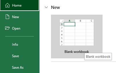
- First, you have to open your Excel spreadsheet.
You have to double-click the Excel program icon. Excel will open to its home page.

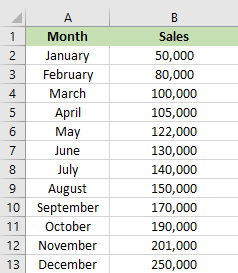
- Input data in your Excel spreadsheet.
You have to input data into two columns. For example, tracking your sales over the year would have the month in the left column and the sales in the right.

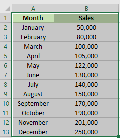
- Select the data that you want to graph.
It will highlight all the data that you want to plot into a line chart. Make sure that you include that header and column.

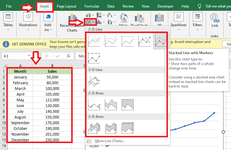
- Insert line chart.
After highlighting the data, click “insert,” then click “insert line.” A drop-down menu will display the different types of lines.
By choosing the type of line you want to use and click it, you will create your line graph in the middle of the Excel window.
- Result
This is the result of line chart for the monthly sales in 2022.


Conclusion
In conclusion, this tutorial, entitled “How to Make or Create a Line Chart in Excel,” will be a useful tool for everyone because you don’t need a lot of time to analyze the data. By just inputting all the data into an Excel spreadsheet and following the given steps provided above, it will reduce your work.
I hope you have learned something new in this tutorial. Thank you very much for continuing to read until the end of this article. In case you have more questions, just visit our website for additional information.

Caren Bautista
Technical Writer at PIES IT Solution
Responsible for crafting clear, well-structured, and beginner-friendly content across the platform. Handles the writing, proofreading, and editorial review of tutorials, guides, and documentation to ensure every article is accurate, readable, and easy to follow.
Expertise: Technical Writing · Content Creation · Documentation · Editorial Writing · JavaScript · TypeScript · Python · Python Errors · HTTP Errors · MS Excel · View all posts by Caren Bautista →