In this pie chart tutorial in Excel, we are going to learn how to make or create one in just a minute or less.
Unlike any other chart, such as a column chart, etc., it is difficult to create a pie chart manually, as it is hard to draw accurate slices for your data. However, using Excel will definitely make your job easier and more efficient.
Moving on, before we proceed to our tutorial, let’s first have a brief understanding of a pie chart.
What is a Pie Chart?
A pie chart, also known as a circle chart, is a statistical chart that is circular. It is used to show the proportion of a whole. Here’s an example of a pie chart:
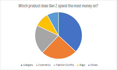
The sample chart above is an illustration of which products Generation Z spends their money most on. As shown above, Gen Z spends more money on gadgets. This sample is just an example and isn’t really based on actual research.
On a different note, most people like pie charts. (Who doesn’t like pies, right?) But people are having trouble making a perfect pie because their precious eyes can’t accurately contrast angles.
So, if you’re one of the people who doesn’t have a choice but to make pie charts and is struggling every single day, you just landed on the perfect site! Without further ado, let’s proceed to our tutorial.
How to Create a Pie Chart in Excel (Tutorial)
Time needed: 1 minute
Here’s a step-by-step tutorial on how to create or make a pie chart using Excel.
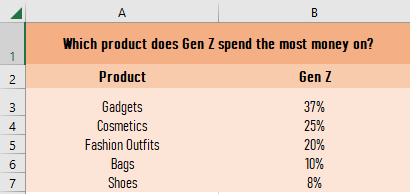
- Open Excel and input the data.
The first thing we should do is open a blank Excel worksheet, then input the data for the pie chart.
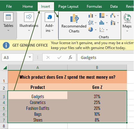
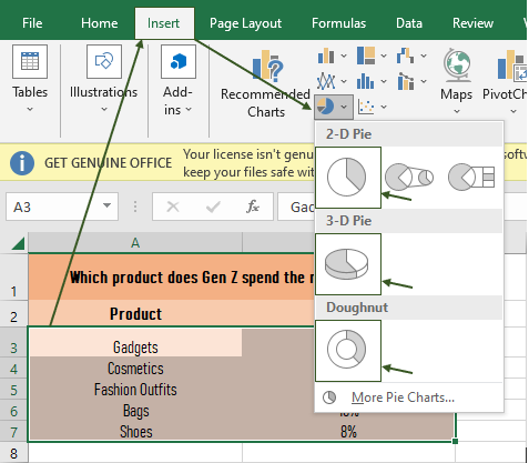
- Select the data, then click the Insert tab.
The next thing we do is select the data that we input, then click the Insert tab, and we can see different charts there.
- Click the pie chart.
After selecting the data and clicking the insert tab, choose or click the pie symbol or the pie chart icon, which is the pie chart. Then you’ll notice three choices: a 2-D pie, a 3-D pie, and a doughnut.
It depends on you on what you’re going to choose, but in this tutorial, we’re going to choose the 2-D pie.
- Click the 2-D pie.
After clicking the 2-D pie, here is the outcome, the pie chart.
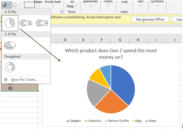
If you want to clearly see the outcome, get back to the picture above (in the pie chart discussion).
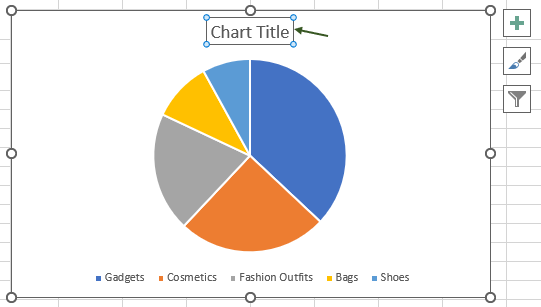
Tip: When selecting data, you can also include the title of your data for it to automatically appear in the title of your chart.In my case, I manually edited the title of the chart. Here’s a manual way to do it:
- Click the chart title, and then you can type or paste your title. And that’s it! You have your pie chart with an amazing title.
Because I love you guys, we will not conclude this tutorial without discussing the functions of the three boxes above (see image above): the plus sign, which is known as chart elements; the paintbrush sign, which is known as chart styles; and the filter sign, which is known as chart filters.
Functions of Chart Elements, Chart Styles, and Chart Filters
1. Chart Elements
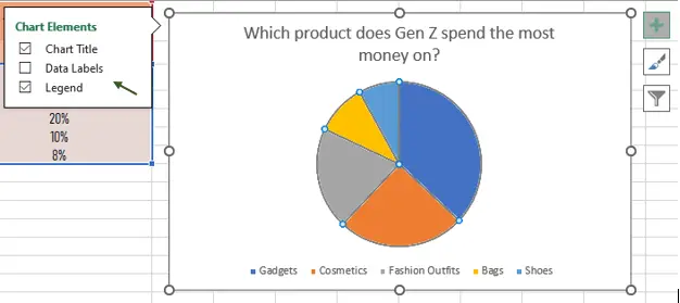
In the chart elements, we can control what we desire to display in our chart.
As shown in the picture, you can check and uncheck the chart title, which is at the top of the chart; the data labels, which are shown inside the pie; and the legend, which is at the bottom of the chart.
2. Chart Styles
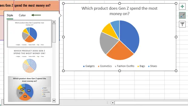
In the chart styles, we can control the chart style, chart color, and pie color by clicking on the style and color we want for our chart.
As shown in the picture, you can find different designs or styles by scrolling that scroll panel at the side. And you can also choose a different color for your pie by clicking the color tab.
3. Chart Filters
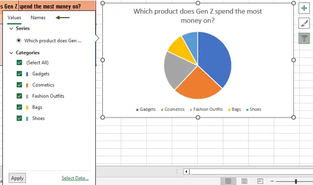
In the chart filters, we can control the values in our pie as well as the names.
As shown in the picture, you can exclude one or more of the categories you input in your data by unchecking that check box. As for the names, you do the same.
Conclusion
In conclusion, this tutorial is a key to making our work in creating a pie chart easier and more effective. As a matter of course, we can do this by using Excel.
I think that’s it for this tutorial. I hope you’ve learned something from this. If you have any questions, please leave a comment below, and for more educational contents, visit our website.
Thank you for reading!

Elijah Galero
Programmer & Technical Writer at PIES IT Solution
Elijah Galero is a programmer and writer at PIES IT Solution, author of 175+ tutorials at itsourcecode.com. Specializes in Python error debugging (AttributeError, TypeError, ModuleNotFoundError), Python programming tutorials, and Microsoft Excel how-to guides for BSIT students and productivity learners.
Expertise: Python · Python Errors · Python AttributeError · Python TypeError · ModuleNotFoundError · MS Excel · MS PowerPoint · View all posts by Elijah Galero →