
How do we create a gauge chart using Excel? In this tutorial, you’ll learn how to create a gauge chart or speedometer chart in Excel step-by-step in order for you guys to visualize your data easily and effectively.
In Microsoft Excel, there are different charts that are a great way to analyze data that you may be able to use, depending on your preference. One of those charts you can use is the gauge chart.
What is a Gauge Chart?
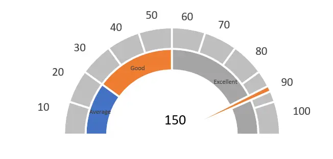
A gauge chart, also known as a speedometer chart or dial charts, is a combination of a doughnut chart and a pie chart in one chart. It is mostly used for presenting sales performance and other visualization situations.
Gauge charts shows the minimum, the maximum, and current values presented. It helps to track a single in opposition to its target, though it is just a single-point chart.
A speedometer chart is also similar to what you would see in a car, with a needle pointing out numbers or on the gauge. The needle changes its position when there is new data.
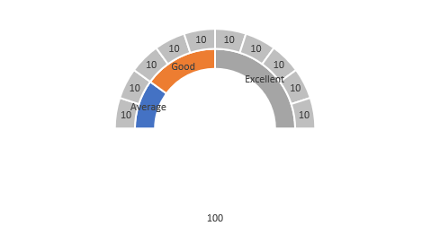
This is what a gauge chart in Excel looks like, as shown in the image below.
How to create a Gauge Chart in Excel?
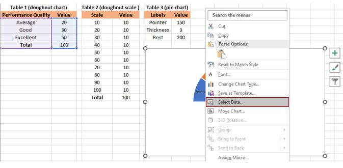
The first thing we should do in making a gauge chart in Excel is to create data points and scales, and we also need to make three tables to create the gauge chart.
You should prepare some data ranges, as you can see in the image below.
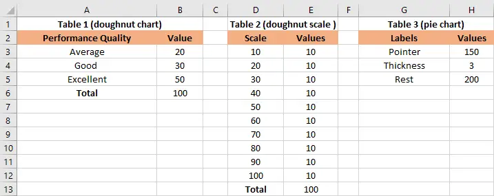
In Table 1, you need to create a category using a doughnut chart. This table of data represents the performance quality, and its value depends on what you need.
In this example, we use average, good, and excellent. This will help you fully understand the performance. Its values range from 0 to 100.
In Table 2, you need to create a scale using a doughnut chart. This table is used to create scales that range from 0 to 100. You can change the label of ranges if you want to have distinct ranges.
In Table 3, you need to create a needle using a pie chart. This table denotes the pointer, and we have three values that we will use to create the pie chart for the needle.
You can specify the value you want; the rest value indicates the total value of table 1 subtracted from the pointer value and the pointer thickness.
Time needed: 5 minutes
Here is a step-by-step guide on how to create or make a gauge chart, also known as a speedometer, in Excel.
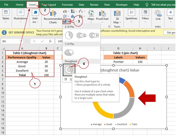
- Here is a step-by-step guide on how to create or make a gauge chart, also known as a speedometer, in Excel. After you prepare the data from table 1 until table 3, you need to highlight table 1, then click “Insert.” Select “Insert Pie or Doughnut Chart“; after that, a doughnut chart will display in your worksheet.

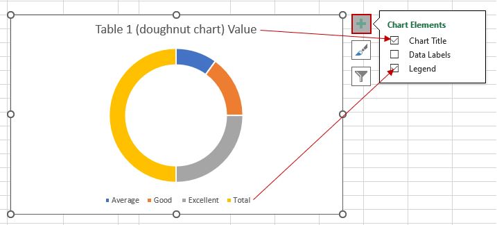
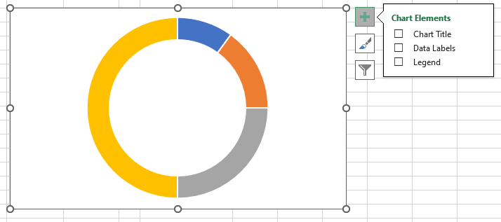
- Select the doughnut chart and click the plus sign icon (+), then uncheck the chart title and legend.

- It will look like this:

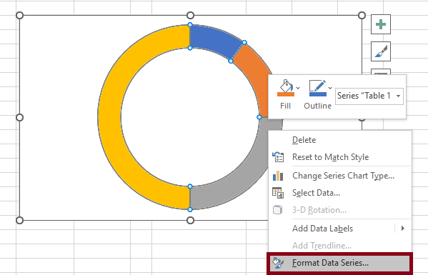
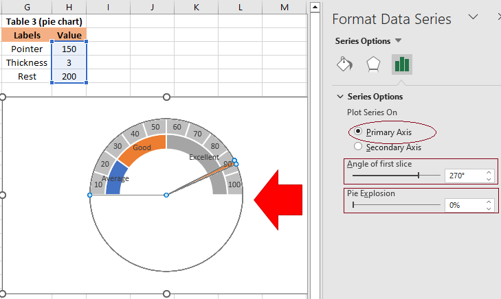
- Right-click the doughnut chart and choose “Format Data Series” from the context.

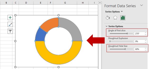
- After that, in the Format Data Series Pane, below “Series Options,” set the “Angle of the first slice“ to 270°. Then, you can set the “Doughnut Hole Size” to 60%, depending on what you want, and you will get something like this.

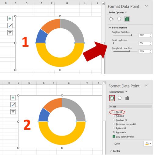
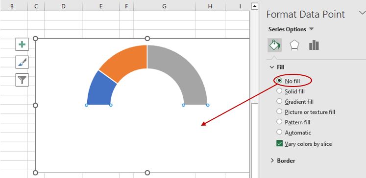
- You need to hide the lower part of the doughnut chart; just double click in order to select the lower half. In “Format Data Point,” under “Series Options,” click the “Fill & Line“ icon.

- Then select “No fill” to make the lower part of the doughnut chart invisible.

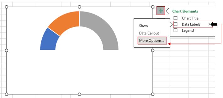
- We are done with the first part of the gauge chart now; let’s add data labels to make the gauge chart easier to read and understand.
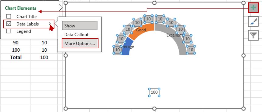
The Chart Elements check list will appear after you click the chart and select the plus sign icon (+). Select the arrow on the right side of the data labels, then click “More Options.”
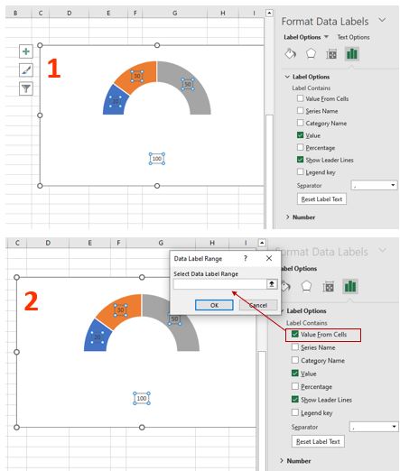
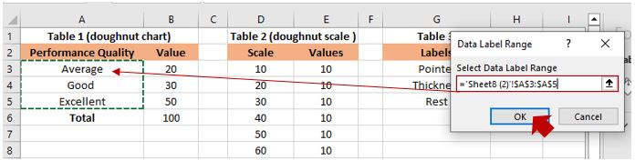
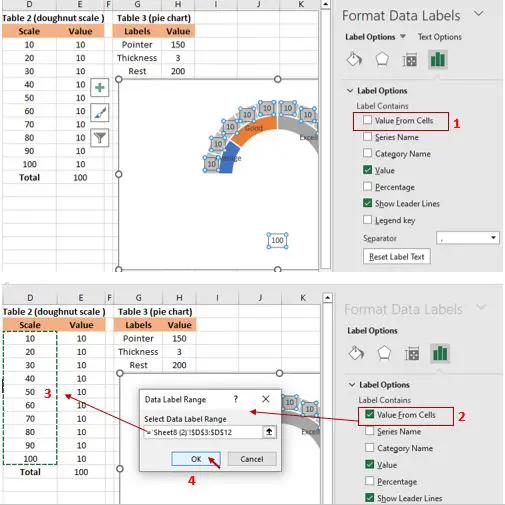
- After clicking “More Options,” the Format Data Labels pane will display. Below the “Label Options,” check the “Value From Cells” option. Then, the Data Label Range dialog box will appear.

- In the popped out “Data Label Range” dialog box, select the “performance quality” from table 1, and then click “OK.”

- It will look like this:

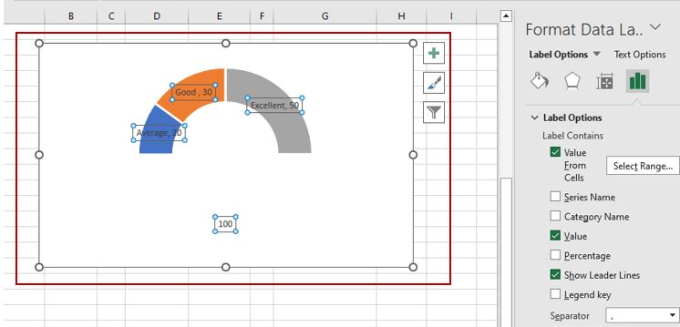
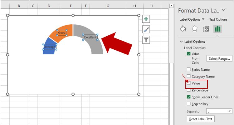
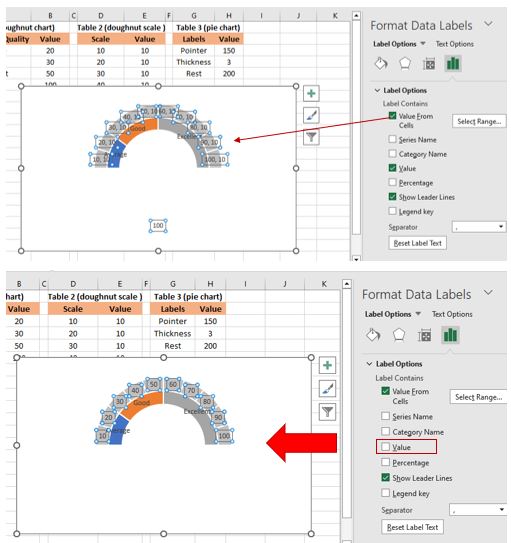
- Data labels have been added to the chart; then, you should uncheck the “Value” option in the “Label Contains” section under “Label Options.”
The reason is to remove the value from the labels in your chart. By doing so, you can format the data point with the specific colors you need.
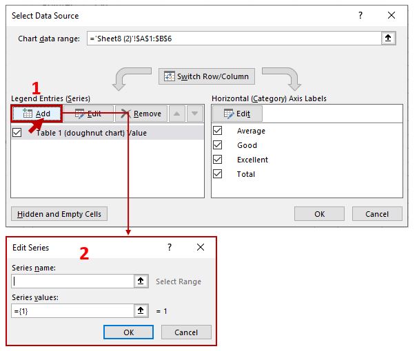
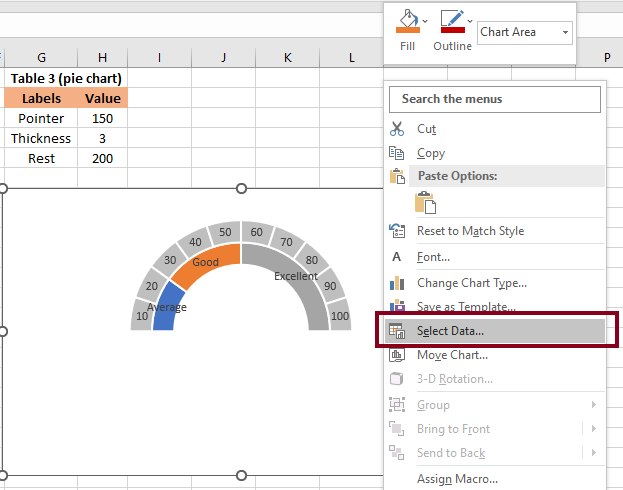
- Now you should create the second doughnut chart to show the scale. Right-click the chart, then click “Select Data” from the context menu.

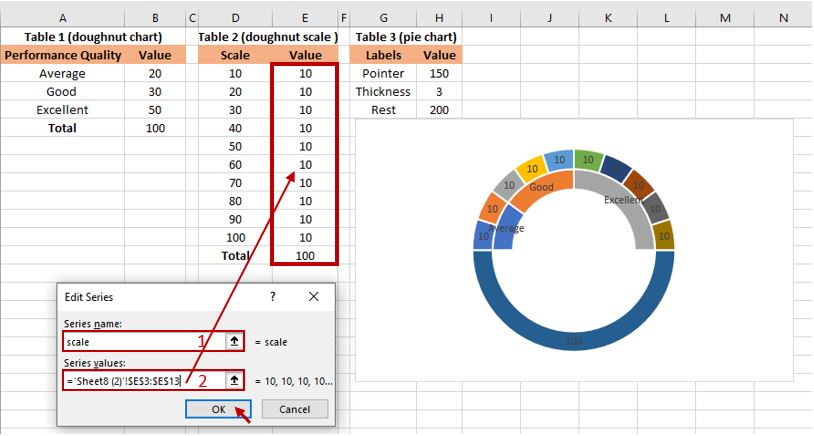
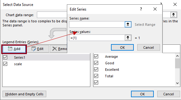
- After you click “Select Data,” the “Select Data Source” dialog box will display. Click the “Add” button, and then “Edit Series” will appear.

- In the “Edit Series” box, input the name of what you have written in your table 2, for example, “Scale” in “Series name.” Then, in “Series values,” highlight the value data in the same table. Click “OK.”

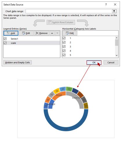
- After you click the “OK” button, the “Select Data Source” dialog box will display again, and you just click “OK.” Then, you’ll see the doughnut chart.

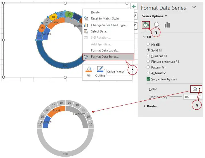
- To make the second doughnut chart look more professional, format it in gray. Click the second doughnut chart, then right-click and select “Format Data Series.” Click the “Fill &Line” icon, then click “Fill Color” and change the color to gray.

- You must hide the lower half of the second doughnut chart once again; double-click the lower-half doughnut chart. “Format Data Series” will appear; click the “Fill and Line” icon, then “No Fill” to hide it.

- Result

- Now, let’s add the data labels for the data series. Click the chart, and then in the Chart Elements, select Data Labels and click “More Options.”

- After selecting “More Option,” “Format Data Labels” appears; then click the check box of the “Value From Cells“ option. “Data Label Range“ dialog box will pop out; select the scale labels from Table 2, then click “OK.”

- After that, uncheck the “Value“ option in the “Label Options“ section.

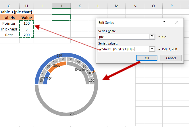
- We already finished the two doughnut charts; now it’s time to create the pie chart for the needle. Right-click the chart, then click “Select Data” from the Design tab.

- After you click “Select Data,” the Select Data Source dialog box displays; click the “Add“ button. The “Edit Series” dialog box will appear.

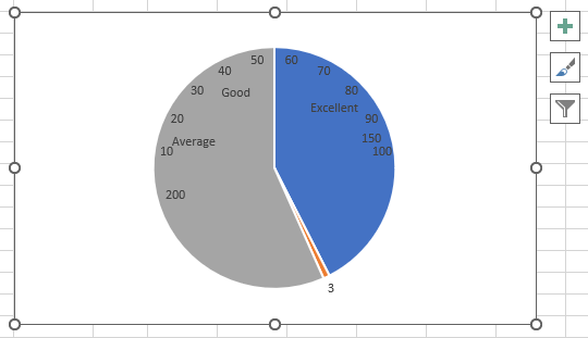
- Input a name into the “Series name” text box, and then in the “Series values” box, select the value from table 3. Then the “Select Data Source” dialog box will appear again, and you just have to click “OK.” You’ll get the image below.

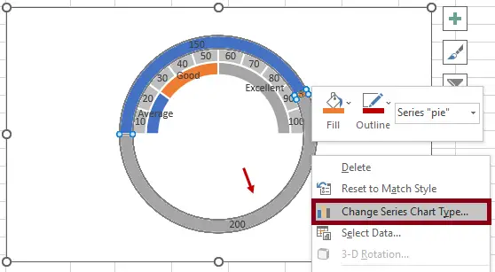
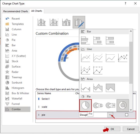
- Now, you should change the doughnut chart into a pie chart. Right-click the outside doughnut chart, and then click “Change Chart Type.”

- The “Change Chart Type” dialog box will appear, and then select “pie” from the drop-down list. Then select “Pie” and click “OK.”

- Once you click “OK,” the doughnut chart will be changed into a pie chart. The result will be like this:

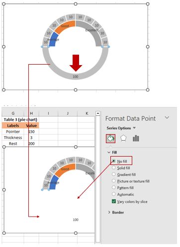
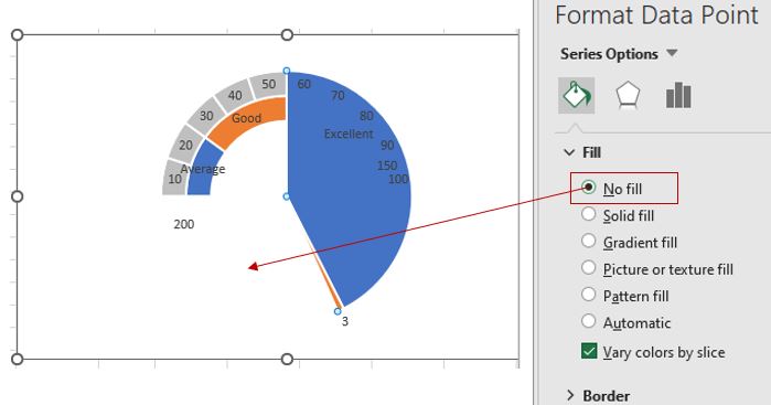
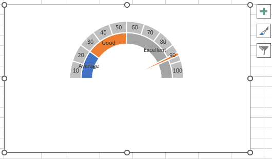
- Now, you need to format your pie chart; the two large slices must be hidden. You only have to double-click the gray area, and “Format Data Point” will display. Click “No fill” from the “Fill” option. The same process will be used on the color blue.

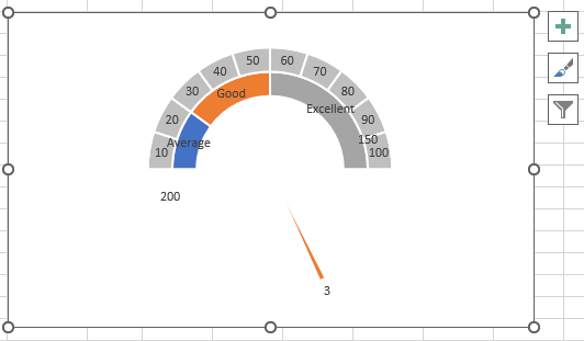
- The result will be as shown in the image below.

- We are done hiding the two big slices. After that, double click to select the pie chart. Then, “Format Data Point” will display from the context menu.
You must input 270° in the “Angle of first slice“ box. Also, you can change the “Pie Explosion“ value for the pie chart to make the pointer stick out from the doughnut chart as you like.
- The gauge chart has been successfully created.

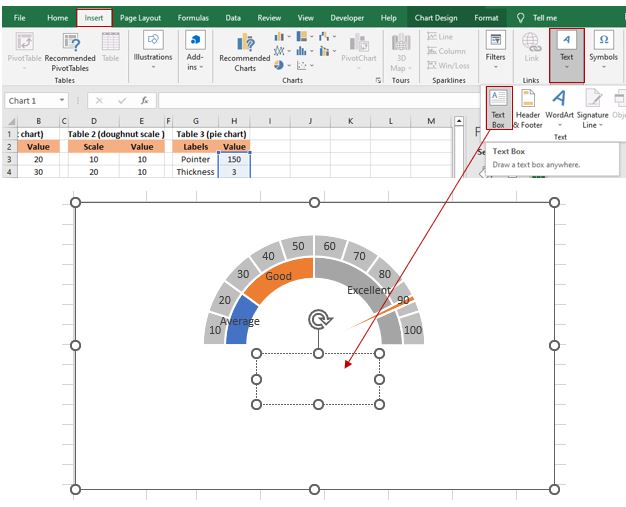
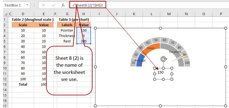
- Now, you have to add a custom data label for the needle. Insert “Text Box” in the middle.

- After you draw a text box, in the formula bar, enter “=”, select the pointer values cell, then press the “Enter” key. The result will be in the textbox.

- Finally, you are done creating your gauge chart. The last step that you need to execute is to move all the data labels to the end corners.

Conclusion
With the help of this tutorial, learn how to create a gauge chart, also known as a speedometer, in Excel. You can certainly make one with our simple step-by-step instructions.
The concept of gauge charts is taken from an automobile’s speedometer and serves as the foundation. It is preferred by many because you can easily understand the result, whether it is high or low.
Thank you very much for continuing to read until the end of this article. In case you have more questions, feel free to comment. You can also visit our website for additional information.

Caren Bautista
Technical Writer at PIES IT Solution
Responsible for crafting clear, well-structured, and beginner-friendly content across the platform. Handles the writing, proofreading, and editorial review of tutorials, guides, and documentation to ensure every article is accurate, readable, and easy to follow.
Expertise: Technical Writing · Content Creation · Documentation · Editorial Writing · JavaScript · TypeScript · Python · Python Errors · HTTP Errors · MS Excel · View all posts by Caren Bautista →