In this tutorial, we are going to learn how to create a scatter plot using Excel. Aside from that, we are also going to study its definition as well as the function of chart elements, chart styles, and chart filters.
In accordance with our research, we found out that a scatter chart and a line chart are alike. The only difference is the way they plot data on the y-axis and x-axis.
Moving on, before we proceed to our tutorial, let’s first have a brief understanding of a scatter plot.
What is a Scatter Plot?
A scatter plot, also called a scatter chart or xy chart, is a type of chart that compares pairs of data and shows the relationship between them. Here’s an example of a scatter plot:
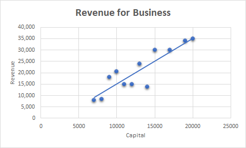
The sample above is an illustration of the revenue of a business in each capital. This is just an example and isn’t really based on actual research or actual business.
Note: You can add a trendline to your graph, like I did in my example above.Anyway, we might already have a lot of thoughts or even confusions in our minds about how to do that thing for our businesses or other data we wanted to present using a scatter plot. So without further ado, let’s move on to our tutorial.
How to Create a Scatter Plot in Excel (Tutorial)
Time needed: 1 minute
Here’s a step-by-step tutorial on how to create or make a scatter plot in Excel.
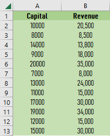
- Open Excel and input the data.
The first thing we should do is open a blank Excel worksheet, then input the data set for the scatter plot.
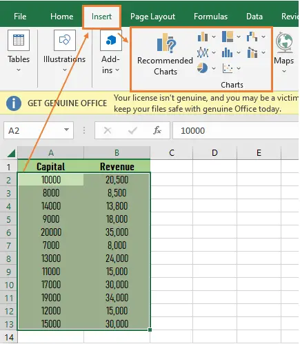
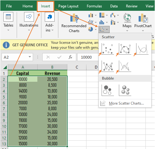
- Select the data, then click the Insert tab.
The next thing we do is select the data that we input, then click the Insert tab, and we can see different charts there.
Note: The map beside the boxed chart is part of the charts.
- Click the scatter chart.
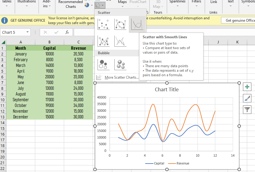
After selecting the data and clicking the insert tab, choose or click the scatter chart. Then you’ll notice five types of scatter plots: the scatter, the scatter with smooth lines and markers, the scatter with smooth lines, the scatter with straight lines and markers, and the scatter with straight lines.
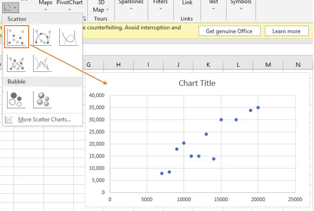
It depends on you on what you’re going to choose, but in this tutorial, we’re going to choose the first one, or the scatter alone, which means without lines.
Note: See the pictures below of each graph to see its meaning and differences.
- Click the Scatter.
After clicking the scatter button, here is the outcome, the scatter plot.
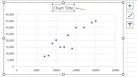
Tip: When selecting data, you can also include the title of your data for it to automatically appear in the title of your chart.
In my case, I manually edited the title of the chart. Here’s a manual way to do it:
- Click the chart title, and then you can type or paste your title. And that’s it! You have your scatter plot with a title.
Since you’ve made it this far, we will not conclude this tutorial without discussing the functions of the three boxes above (see image above): the plus sign, which is known as chart elements; the paintbrush sign, which is known as chart styles; and the filter sign, which is known as chart filters.
Functions of Chart Elements, Chart Styles, and Chart Filters
1. Chart Elements
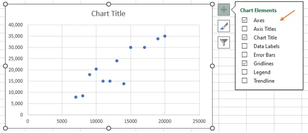
In the chart element, we can control what we desire to display in our chart.
As shown in the picture, you can change (add or remove) the chart elements such as the titles (horizontal axis title, vertical axis title), the data labels, the error bars, the gridlines, and more. It is done by checking or unchecking the checkbox provided.
2. Chart Styles
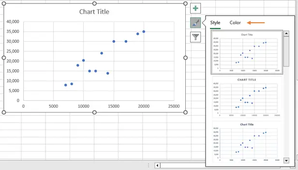
In the chart styles, we can control the chart style and color scheme for our charts by, of course, clicking on the style and color we want for our chart.
As shown in the picture, you can find different designs or styles by scrolling that scroll panel at the side. And you can also choose a different color for your chart by clicking the color tab.
3. Chart Filters
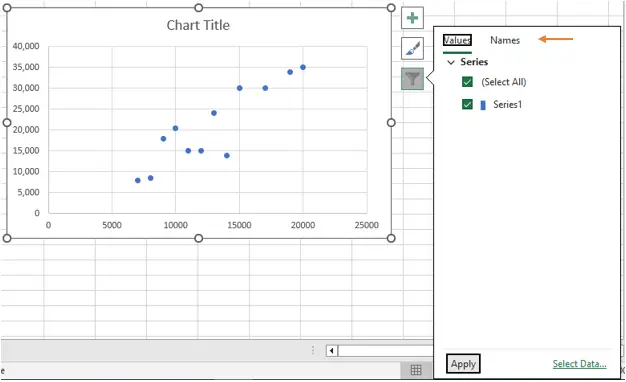
In the chart filters, we can control what data points and names we want to be visible in our chart.
If you have a lot of data, you can exclude one or more of the categories you input in your data by unchecking that check box. As for the names, you do the same.
Before we end, let me first show you the different types of scatter charts.
- Scatter with Smooth Lines and Markers
- When you have a few data points and the data represents a set of x,y pairs based on a formula, use this chart.

- Scatter with Smooth Lines
- The same with “scatter with smooth lines and markers,” when you have a few data points and the data represents a set of x,y pairs based on a formula, use this chart.
- Scatter with Straight Lines and Markers
- When you have a few data points and the data represents separate measurements, use this chart.
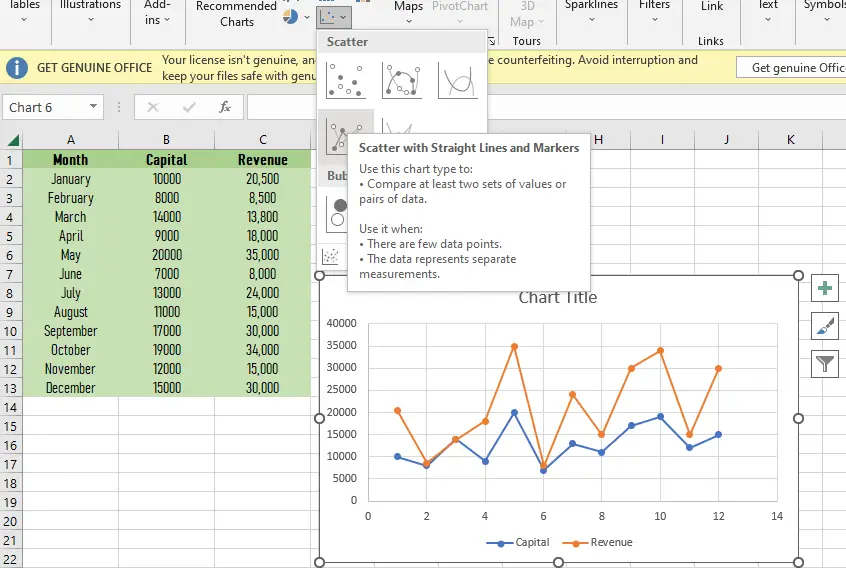
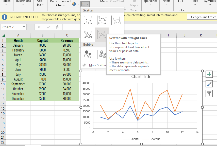
- Scatter with Straight Lines
- The same with “scatter with straight lines and markers,” when you have a few data points and the data represents separate measurements, use this chart.
Conclusion
In conclusion, this tutorial is a key to making our work in creating a scatter plot easier and more effective. As a matter of course, we can do this by using Excel.
I think that’s it for this tutorial. I hope you’ve learned something from this. If you have any questions, please leave a comment below, and for more educational contents, visit our website.
Thank you for reading.

Elijah Galero
Programmer & Technical Writer at PIES IT Solution
Elijah Galero is a programmer and writer at PIES IT Solution, author of 175+ tutorials at itsourcecode.com. Specializes in Python error debugging (AttributeError, TypeError, ModuleNotFoundError), Python programming tutorials, and Microsoft Excel how-to guides for BSIT students and productivity learners.
Expertise: Python · Python Errors · Python AttributeError · Python TypeError · ModuleNotFoundError · MS Excel · MS PowerPoint · View all posts by Elijah Galero →