
In this tutorial, we will explore how to make or create an area chart in Excel. Choosing the perfect chart for your graphical presentation is not easy, when you have many options.
However, choosing the right chart is significant in order to achieve some results. You can easily create an area chart by following our step-by-step guide for you.
This tutorial helps you create an area chart, a stacked area chart, and a 100% stacked area chart in Excel. Aside from that, we also provide samples for you to be able to understand easily and clearly.
What is an Area Chart in Excel?
An area chart is based on a line chart and is used to display quantitative data. The area between the axis and the line was filled with different colors separately.
The data representation in the area chart is visible and easy to understand. An area chart is a useful tool for showing the whole relationship of each data series that changes over time.
An area chart is a line chart with the areas below the lines filled with colors. Use a stacked area chart to display the contribution of each value to a total over time.
Let’s take a look at the example.
Moreover, this chart helps to analyze the overall and individual trend relationships of the value presented.
Note: Both a line chart and an area chart show a graphical trend representation over time. Area charts are excellent for highlighting changes between cumulative data sources, whereas a line chart uses straight line segments to connect separate data points that still change continuously.
What is area chart use for?
Area charts were used to represent or show cumulated data values using numbers or percentages over time. The chart has an x-axis that displays categories of data and a y-axis that shows numerical data.
An area chart has an x-axis that displays the categories of the chart, and it has a y-axis that shows the numerical data.
How to make an Area Chart in Excel?
Now that you fully understand what an area chart is, let’s proceed with creating your area chart in Excel. The following steps will help you create an area chart in Excel.
Time needed: 1 minute
To create a area chart, here is the step-by-step guide you need to follow.
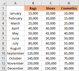
- First, you have to open your Excel spreadsheet and input your data.
If you have the data, then proceed to step 2.

- Select the data that you want to graph.
Highlight all the data that you want to plot into an area chart.

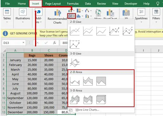
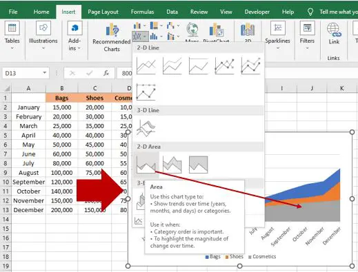
- Select the Insert tab.
After highlighting the data, go to “insert,” then click the “insert line” of the area chart.
A drop-down menu will display the different types of lines, and there are different types of area charts.
- Choose what type of area chart you want to use.
Select the area chart and refer to the images, which are automatically shown.

- Result
The result will automatically display once you click the type of area chart you choose.

Types of Area chart
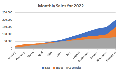
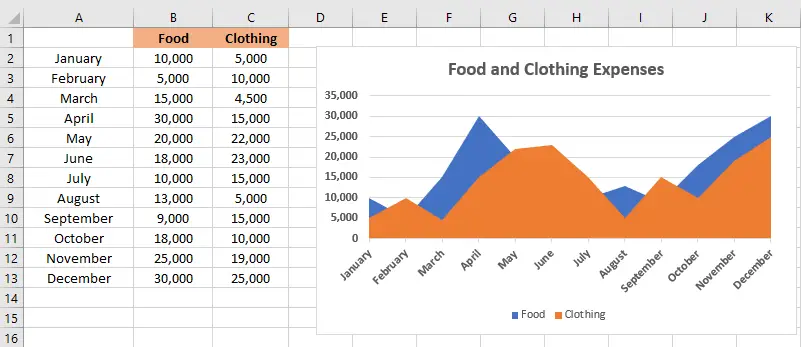
Now, let’s explore the comparison of three types of area charts in Excel with an example. The example of an area chart below shows the comparison of food and clothing in a year.
Area Chart
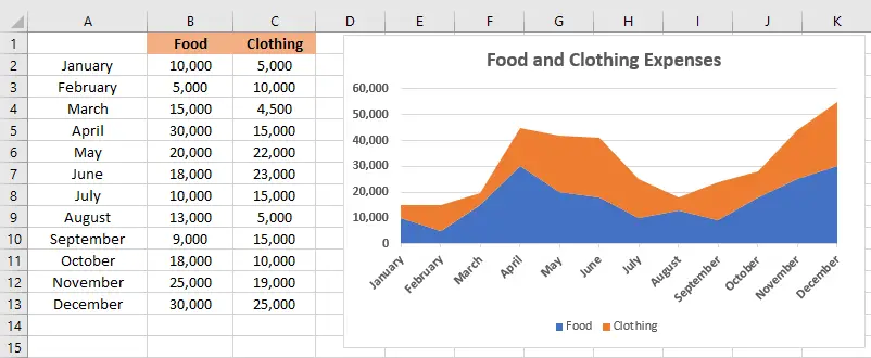
Stacked Area Chart
The stacked area chart doesn’t have a common baseline. Instead, each area is “stacked” on top of each preceding area.
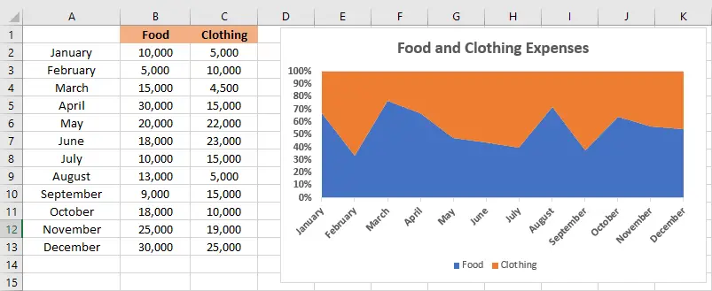
100% Stacked Area Chart
Each area is also “stacked” on top of each preceding area, but each area is a percentage of measurements at a particular data point.
Stacked area charts aren’t recommended for very uneven areas. You can use a bar chart or column chart instead.
Conclusion
In this tutorial, we learn how to create an area chart in Excel with guides and examples. Typically, this chart is good to use for analyzing data that you need to showcase or show trends over time among related attributes.
We’re glad to know that you made it. I hope you have learned something new in this tutorial.
Thank you very much for continuing to read until the end of this article. In case you have more questions, just visit our website for additional information.

Caren Bautista
Technical Writer at PIES IT Solution
Responsible for crafting clear, well-structured, and beginner-friendly content across the platform. Handles the writing, proofreading, and editorial review of tutorials, guides, and documentation to ensure every article is accurate, readable, and easy to follow.
Expertise: Technical Writing · Content Creation · Documentation · Editorial Writing · JavaScript · TypeScript · Python · Python Errors · HTTP Errors · MS Excel · View all posts by Caren Bautista →