In this tutorial, we will learn how to add standard error bars to a chart in Excel as well as how to format it. Apart from that, we will also learn the functions of chart elements, chart styles, and chart filters.
Adding error bars to our charts helps us spot the margin of error by just looking at them. But we can’t do that by not learning how to do it, so we must know.
However, before we start our tutorial, let’s first briefly understand error bars.
Error Bars in Excel
The error bars in Excel charts are a practical tool for quantifying accuracy and illustrating data variability. It can be inserted in a column chart, bar chart, line chart, area chart, combo chart, scatter or XY chart, or bubble chart.
Moreover, you can insert error bars as standard error, fixed value, percentage, and standard deviation error bars. Here’s an example of a chart with error bars.
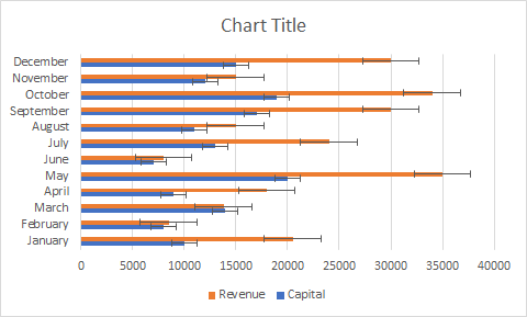
Note: The sample chart above is a bar chart. It shows in the chart the revenue of a business every month in different currencies.Now, let’s move on to our tutorial.
How to Add Standard Error Bars in Excel (Tutorial)
Time needed: 1 minute
Here’s a step-by-step guide on how to add standard error bars to Excel charts.
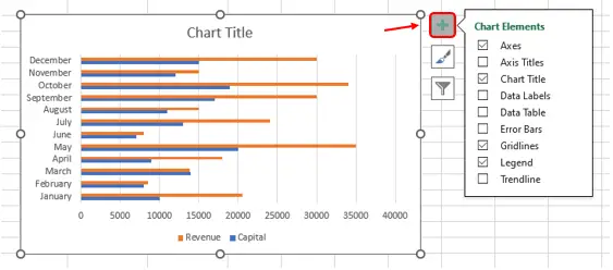
- Click the chart and then the chart elements button.
We should first click anywhere in the chart and then click the plus button or the chart elements button that is found at the upper right side of the chart.
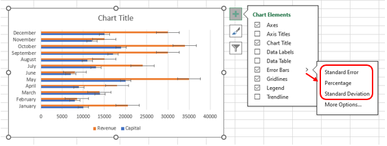
- Click the arrow next to the error bars, then click the “standard error” button.
After clicking the chart elements button, click the arrow next to the error bars, then the standard error button. The error bars will automatically appear in your chart after clicking the button.
- Choose from different error bar options.
You can also choose from different error bar options to change the error amount shown. You can choose from standard error (which we used), percentage, and standard deviation.
Note: Simply click the “more options” button if you only want to put error bars in the specific data series.
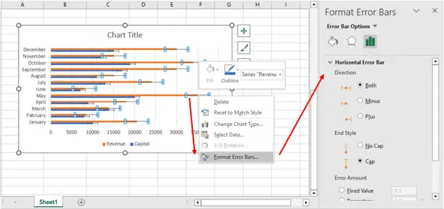
Tips: If you want to format the error bars, simply click the error bar, then right-click and select the "format error bars" button (see the guide below).Format Error Bars
As stated at the beginning of this article, you will learn in this tutorial not only how to add standard error bars to a chart in Excel but also how to format it.
In formatting the error bars (horizontal error bar or vertical error bar), you can control the direction, end style, and error amount of your error bars.
Note: You can also create custom error bars by clicking the custom button in the error amount section and specifying a value.Now, let’s proceed to our guide on how to format error bars.
Guide: Add error bars to your chart, then right-click the error bars and select the “format error bars” button. After that, the “Format Error Bars” panel will appear. Then, you can format whatever you want.
Functions of Chart Elements, Chart Styles, and Chart Filters
1. Chart Elements
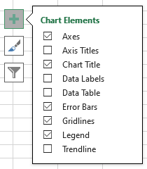
In the chart elements, we can control what we desire to display in our chart.
As shown in the picture, you can change (add or remove) the chart elements such as the titles, the data labels, the error bars, the gridlines, and more. It is done by checking or unchecking the checkbox provided.
Note: The content of chart elements depends on the type of chart.
2. Chart Styles
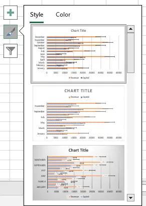
In the chart styles, we can control the chart style and color scheme for our charts by, of course, clicking on the style and color we want for our chart.
As shown in the picture, you can find different designs or styles by scrolling that scroll panel at the side. And you can also choose a different color for your chart by clicking the color tab.
3. Chart Filters
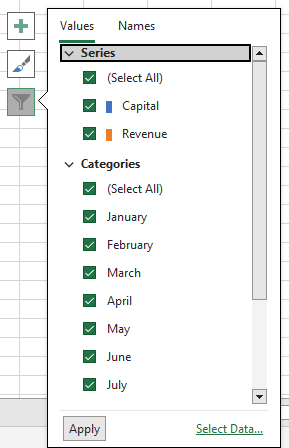
In the chart filters, we can control what data points and names we want to be visible in our chart.
If you have a lot of data, you can exclude one or more of the categories you input in your data by unchecking that check box. As for the names, you do the same.
Conclusion
In conclusion, this tutorial is the key to making our work in “adding and formatting error bars” easier and more effective.
I think that’s it for this tutorial. I hope you’ve learned something from this. If you have any questions, please leave a comment below, and for more educational content, visit our website.
Thank you for reading.

Elijah Galero
Programmer & Technical Writer at PIES IT Solution
Elijah Galero is a programmer and writer at PIES IT Solution, author of 175+ tutorials at itsourcecode.com. Specializes in Python error debugging (AttributeError, TypeError, ModuleNotFoundError), Python programming tutorials, and Microsoft Excel how-to guides for BSIT students and productivity learners.
Expertise: Python · Python Errors · Python AttributeError · Python TypeError · ModuleNotFoundError · MS Excel · MS PowerPoint · View all posts by Elijah Galero →