In this tutorial, we will demonstrate how to create combo charts, also called combination charts, in Excel. Aside from the easy step-by-step tutorial, we will also discuss “what is a combo chart in Excel and when or how to use it.”
This tutorial will greatly assist you in saving a significant amount of space and time when visualizing various data series.
Are you still confused about how to combine two charts in Excel? Fortunately, this article provides a tutorial for you to be able to create combination charts in Excel in an easy way.
What is a combination chart?
A combination chart, or combo chart, in Excel is a combination of two or more various charts. It typically displays two charts: a bar chart and a line chart are used together on the same chart.
In simple word, combination charts in Excel allow you to present and contrast two different data points that are associated with each other and share a common string field in a single chart.
Note: A combination chart is the best option when you need to display actual and target numbers in the same chart. A simple clustered column chart can be made, or you can make something better by turning one bar into markers.
How to create a combination chart in Excel
In order to create a combination chart, or combo chart, in Excel, you must execute the following steps:
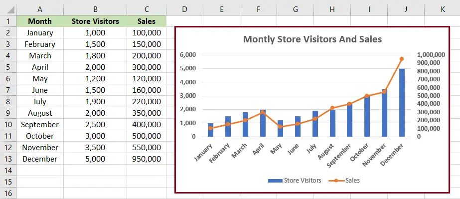
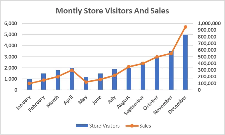
In our example below, the combination chart uses a bar chart and a line graph together. The bar displays the number of store visitors. However, the line shows the value of sales every month.
Time needed: 3 minutes
This example will teach you how to create a combination chart, most commonly known as a combo chart, in Excel.
Let’s get started!
- Open your Excel Spreadsheet.
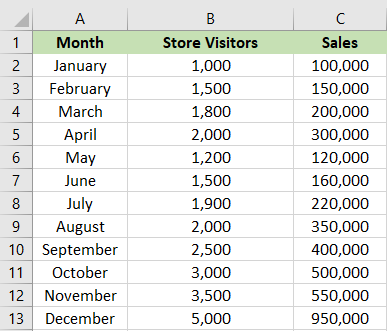
Input all your data needed.

- Select the all the data that you like to see in the chart.
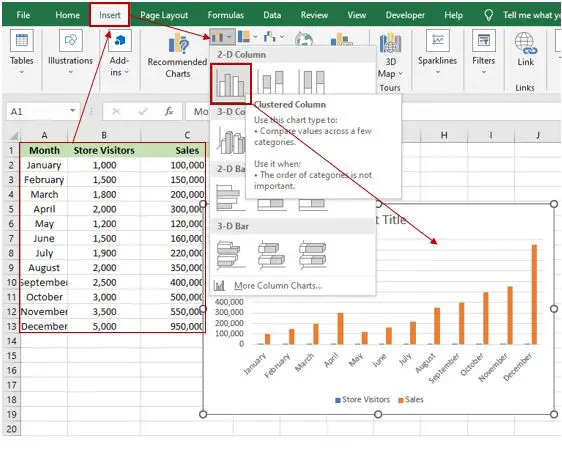
Highlight all the data that you wanted to see in the chart. Clink “insert,” next select “insert column chart or bar chart,” and then choose “clustered column chart.”

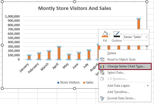
The preceding steps will result in a clustered column chart with month, store visitor, and sales margin plotted. The value of the store visitor is less than the value of sales. That is why it is not really visible. - Select change series chart type.
Right-click on any of the bars, either “stores visitors” or “sales.” Then, click “change series chart type,” and a dialogue box will appear.

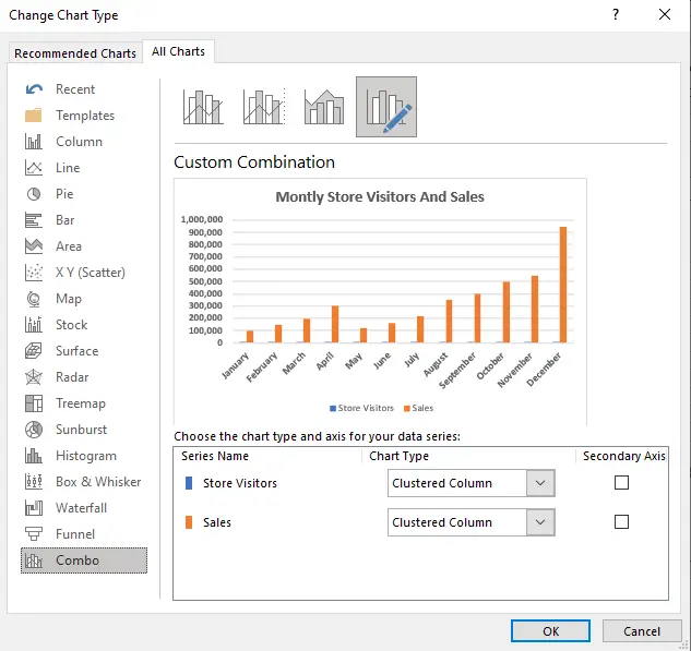
- In the Change Chart Type dialog box.
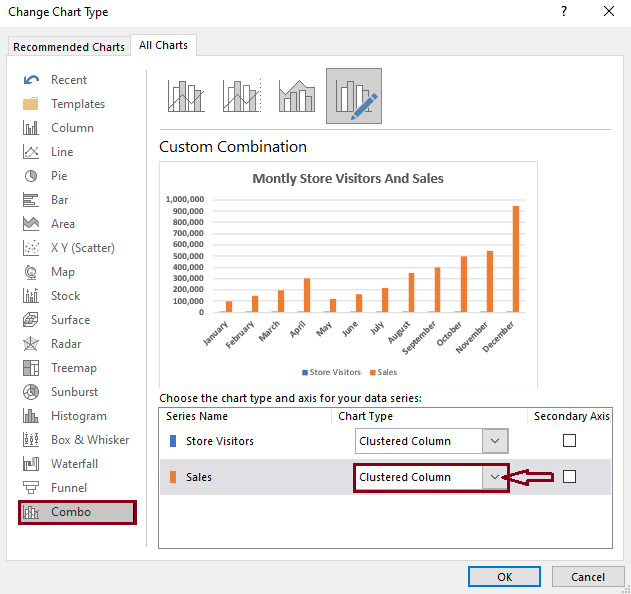
The combo category is selected by default.

- Changing the chart type.
Under “custom combination,” there is a series name and chart type. Click the drop-down menu for sales.

- Select line with markers.
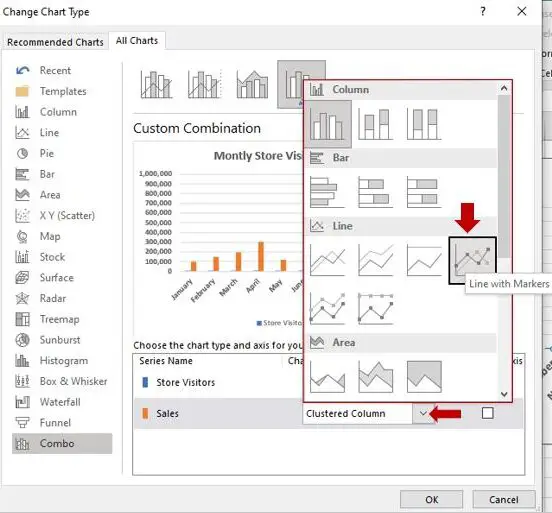
After clicking the drop-down menu for sales, it will display column and bar chart options. Then, select “line with markers.”

- Check secondary axis.
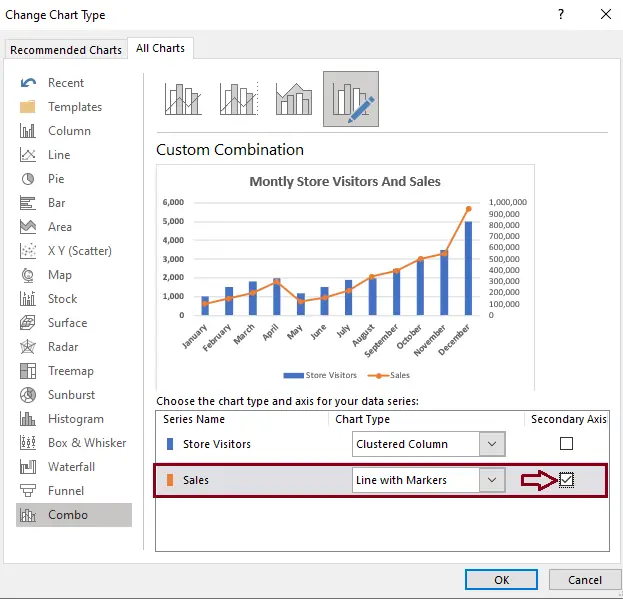
After choosing a “line with markers,” it will return to the Change Chart Type dialog box. You should check the secondary axis and click the “OK” button.
By doing so, it will show the illustration below of the custom combination.
- Result.
It will display the result automatically.

Other ways to create a Combo Chart or Combination chart in Excel
- Select the chart.
- Click “insert,” then go to “combo.” It will show three options.
- Select Clustered Column – Line on Secondary Axis chart.
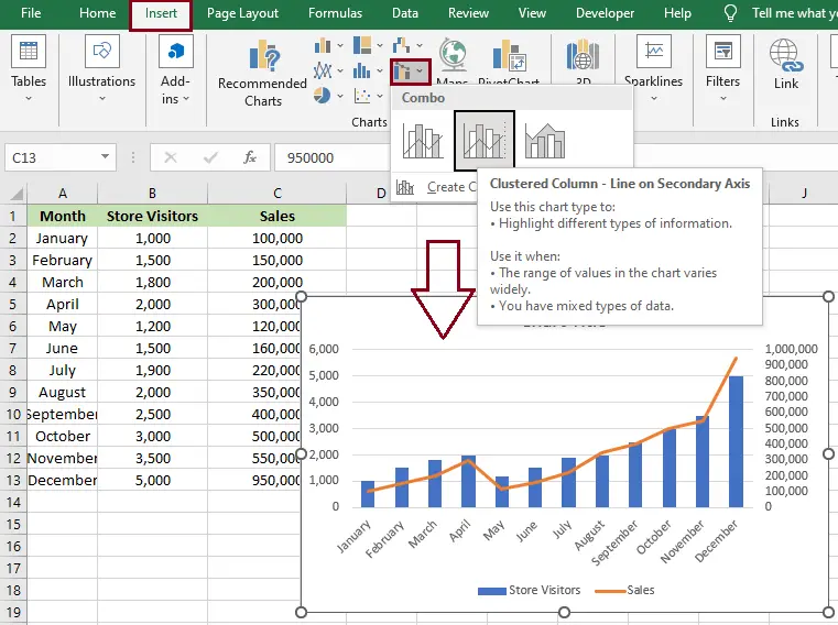
Tip: To quickly create a combo chart like the one shown above, select “clustered column-line on secondary axis” from the combo chart. If the combo chart is okay or suits your needs, you don’t have to select “create custom combo chart.” However, if you want to change, then go.
4. If you want more types of combination charts, click “create a custom combo chart.”
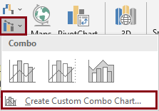
5. After you click “create custom combo chart,” it will display the “Insert Chart” dialog box. Then click the drop-down menu for sales.
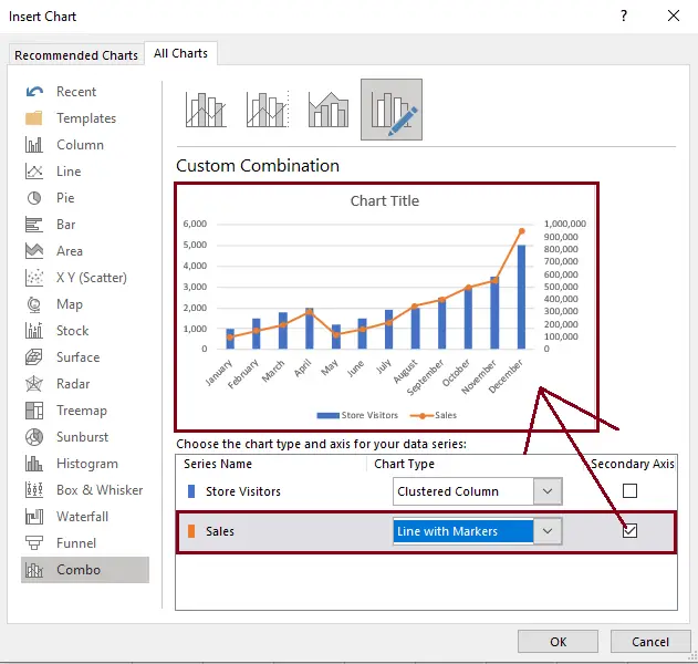
6. After clicking the drop-down menu for sales, it will display column and bar chart options. Then, select “line with markers.”
7. Check the secondary axis and click “OK.”
Result:
The orange line chart shows the value of sales for each month from January to December. The bar chart, on the other hand, shows how many visitors came to the store. The lowest and highest sales can be easily identified by looking at the chart.
Conclusion
In this tutorial, we are able to learn how to combine charts in Excel using a bar chart and a line chart. I hope you followed the step-by-step guide mentioned above on “how to create combination charts in Excel.”
We are pretty sure it will aid your needs in Excel with more productivity if you want to show the contrast between two different data points in one chart. This tutorial on creating combo charts in Excel is the best way to do it.
Thank you very much for continuing to read until the end of this article. In case you have more questions, feel free to comment. You can also visit our website for additional information.


