HTML5 Form Input Type – Beginners Guide for Web Developers – 009
HTML5 Form Input Type – Beginners Guide for Web Developers.
This tutorial is connected from the previous HTML5 tutorial, the “HTML5 Figure and Figcaption“.
In this tutorial, we are going to discuss about new form input types in HTML5. This tutorial will be break down into two parts of tutorial.
Take note first, check out the compatibility of these form input types depending on your browser because it might not be supported but mostly a lot of browsers are being updated to read these form input types.
First, let’s add a form input type numbers code below the article tag in your recent boilerplate HTML5 file.
[html5]
<section>
<form>
<input type="number" name=""/>
</form>
</section>
[/html5]
As you have noticed that it is like a numberic up and down textbox. This is a new form input type by the HTML5.
So, what can we do with this number input? Actually, there are some attributes that we can give to it. We can give it value, step, minimum and maximum attributes.
Let’s try the minimum attribute:
[html5]
<section>
<form>
<input type="number" name="" min="10"/>
</form>
</section>
[/html5]
After reloading your browser, try to type in less than 10. A message will prompt to you that your number input textbox needs greater than 10 value.
For the maximum attribute:
[html5]
<section>
<form>
<input type="number" name="" min="10" max="20"/>
</form>
</section>
[/html5]
Notice that your number input textbox only reaches up to 20.
Let’s add the other attributes:
[html5]
<section>
<form>
<input type="number" name="" min="10" max="20" step="2" value="10"/>
</form>
</section>
[/html5]
Sample number input type.
Notice when you try to press the up and down arrow on your keyboard, the numbers increments and decrements to 2, that is the step attribute while the value gives you the placeholder of your number input textbox.
For us to proceed on our next form input, we have to create a line of code in our main.css for us not having any difficulties later in viewing our form input types.
Open your main.css and add this line of code below the Author’s custom styles comment:
[css]

main {
width: 80%;
margin: 0 auto;
}

input {
font-size: 20px;
}

[/css]
Reload your page and you will see that our main content has changed and also the font size of our input textbox.

Next, range form input type. Range is actually a slider and it is going to have a value of number. So, how the range is rendered is determine by your browser itself.
Try this code below your form input number:
[html5]
<input type="range" name="" min="0" max="50" value="20"/>
[/html5]
Sample range input type.
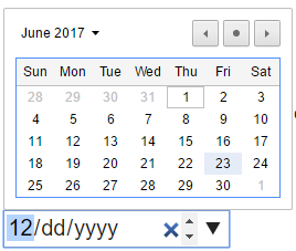
Next, the date form input type. It is a date time picker where you can choose your date depending on the required field that it is intended to an information.
[html5]
<input type="Date name="" value="2017-01-06" min="2017-01-01" max="2030-01-01"/>
[/html5]
Sample date input type.
As you can see you can set your date input type its minimum value and its maximum value range. This is good in terms of minimizing your date value picking range.
Lastly, we are going to add a new form input type which is the color input type.
[html5]
<input type="color" name=""/>
[/html5]I know that this input type is widely supported by browsers. It is a color picking widget which opens up your system’s color picking menu.
On our next tutorial, we will be discussing about HTML5 Form Input Type Part II. Stay tuned webbies!
For questions or any other concerns or thesis/capstone creation with documentation, you can contact me through the following:
E-Mail: [email protected]
Facebook: facebook.com/kirk.lavapiez
Contact No.: +639771069640
Ian Hero L. Lavapiez
BSIT Graduate, soon to be MIT.
System Analyst and Developer
Related topic(s) that you may like:

