In this thermometer chart tutorial in Excel, we will learn how to make or create one in just a minute or less. Aside from that, we will also learn in this article how to customize our chart and make it look exactly like a thermometer.
Before we proceed to our tutorial, let’s first have a brief understanding of it. What exactly is a thermometer chart, and what is its function?
What is a Thermometer Chart?
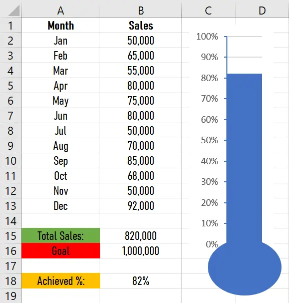
A thermometer chart is a chart that indicates the degree of objective achievement. It displays the percentage of achievement. Here’s an example of it with its data sets:
Now that we understand what a thermometer chart is, let’s proceed to our tutorial on how to create and customize it.
How to Create a Thermometer Chart (Tutorial)
Time needed: 1 minute
Here’s a step-by-step guide on how to create a thermometer chart in Excel.
- Open Excel and input the data.
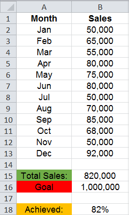
First, we should open a blank Excel worksheet, then input the data set for the thermometer chart.
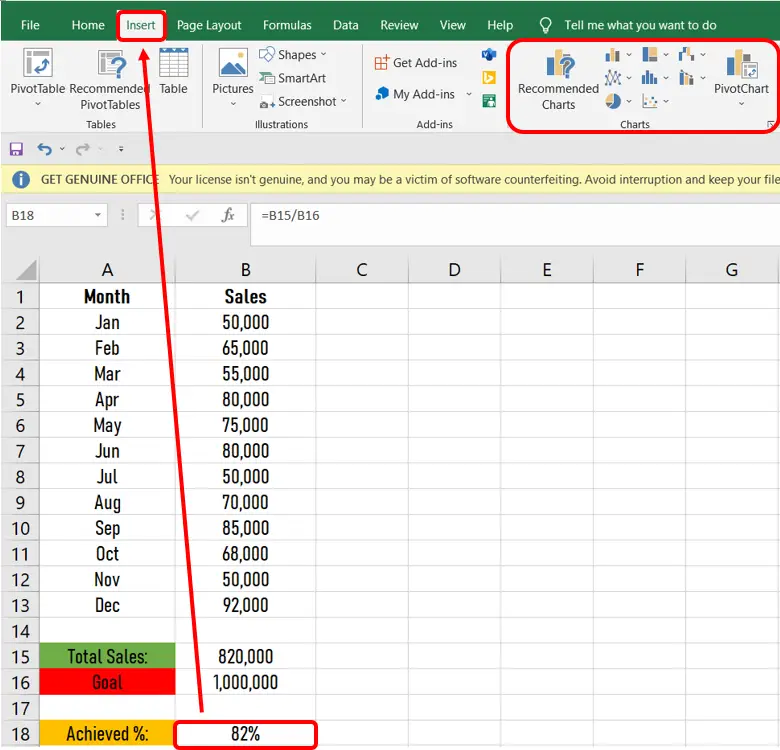
- Select Cell B18, then the Insert tab.
The next thing we do is select cell b18, then click the Insert tab, and we can see different charts there.
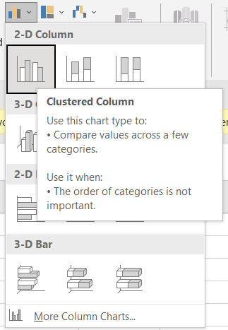
- Click the column symbol, then select the clustered column chart.
After clicking the insert tab, you’ll see different charts there. What we’re going to do is click the column symbol in the charts group, then select clustered column.
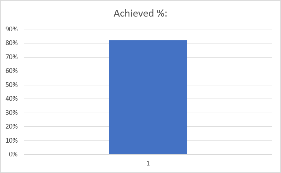
- Result.
Note: You can also leave the cell beside cell b18 empty. (See sample above.) We only put “achieved” in that cell for clarification.
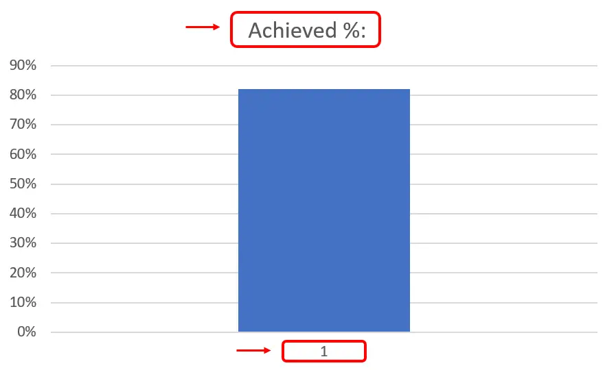
Note: As you can see, it doesn't actually look like a thermometer. So, what we're going to do is customize it. Learn more below.Customize a Thermometer Chart
The following will show you how to customize your chart: This will help you make it look exactly like a thermometer. Without further ado, here’s a step-by-step guide on how to customize your chart:
Step 1: Remove the chart title and the horizontal axis.
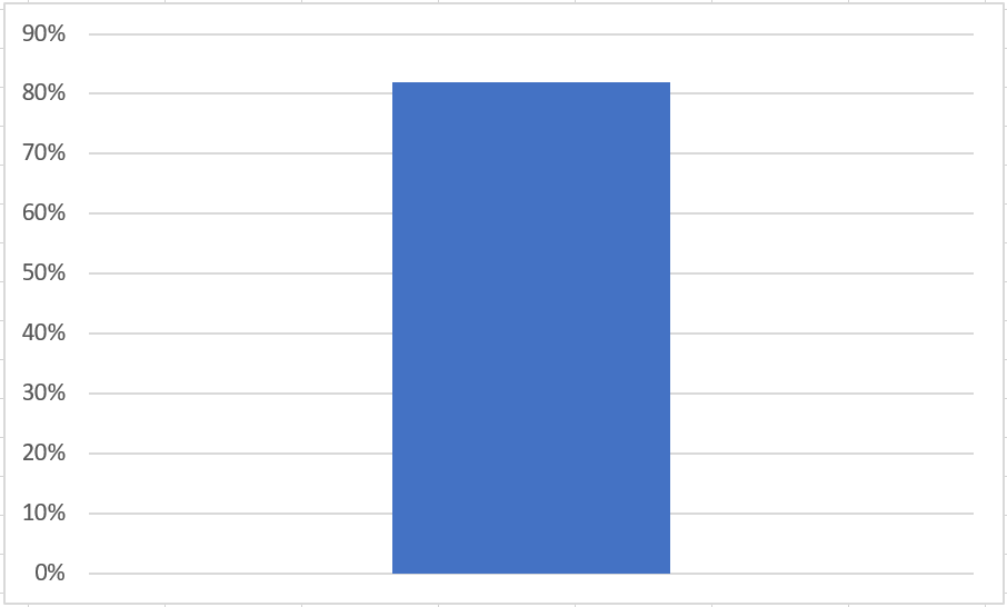
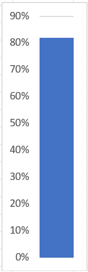
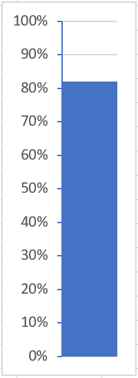
Result.
Step 2: Right-click the blue bar, then select format data series.
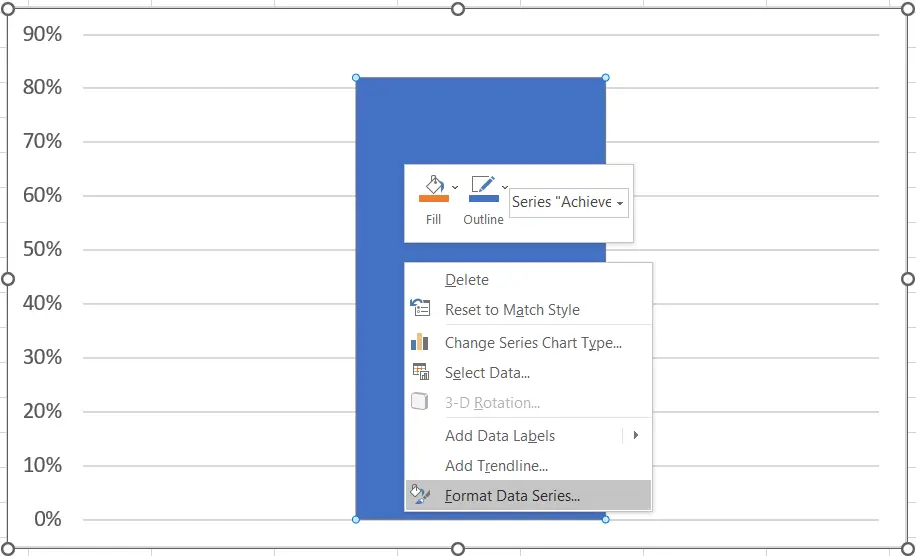
Step 3: Change the gap width to 0%. Then you can manually resize the chart or change the width of the chart to the width you want.
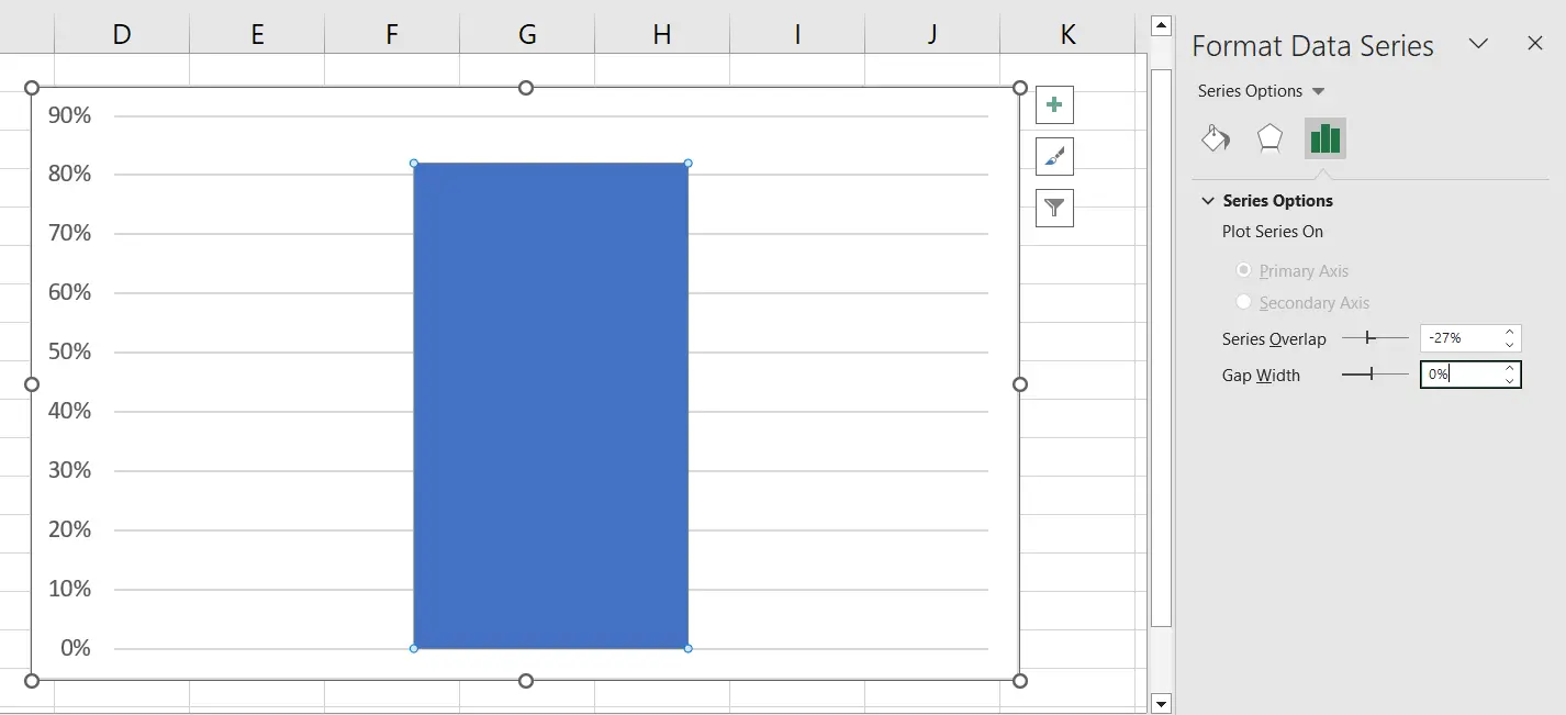
Result.
Step 4: Right-click the percentages of the chart, then select the format axis.
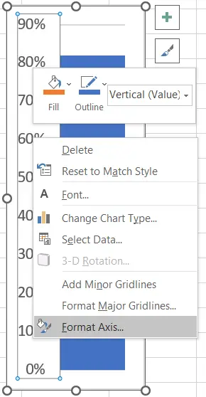
Step 5: Fix the minimum bound to 0 and the maximum bound to 1. Then change the major tick mark type to “Outside.”
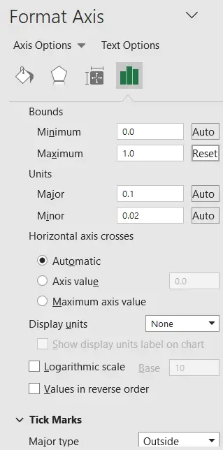
Result.
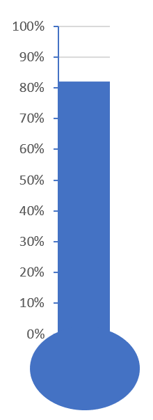
Additional Tip: You can add a circle shape below your chart (see below).In order to add a circle to our chart, we just have to insert an oval shape by clicking the insert tab. The next thing we do is select the shapes in the illustration group, then select the oval shape.
Conclusion
In conclusion, this tutorial is a key to making our work in creating a thermometer chart in Excel easier and more effective.
I think that’s it for this tutorial. I hope you’ve learned something from this. If you have any questions, please leave a comment below, and for more educational content, visit our website.
Thank you for reading!

Elijah Galero
Programmer & Technical Writer at PIES IT Solution
Elijah Galero is a programmer and writer at PIES IT Solution, author of 175+ tutorials at itsourcecode.com. Specializes in Python error debugging (AttributeError, TypeError, ModuleNotFoundError), Python programming tutorials, and Microsoft Excel how-to guides for BSIT students and productivity learners.
Expertise: Python · Python Errors · Python AttributeError · Python TypeError · ModuleNotFoundError · MS Excel · MS PowerPoint · View all posts by Elijah Galero →