
How to make a Pareto chart in Excel? This tutorial will give you the formula on how to create a pareto chart in Excel for all Excel versions. Certainly, from scratch until the end, so just bear with us.
Aside from the step-by-step guide, we’ll also discuss: what is pareto and when to use it? Creating a pareto chart in Excel is simple and easy. Let’s get started and learn from the discussion below.
Pareto analysis in Excel
A pareto analysis is based on the Pareto principle, named after the legendary Italian economist Vilfredo Pareto. The Pareto principle states that about 80% of the effects come from 20% of the causes.
Just like, for example, 80% of the sales come from 20% of the customers. It is a fact that not everything in the world is based on equality.
That is the reason why occasionally it is called the “80/20 principle.” Now, here are a few practical examples of the Pareto principle.
- In economy, the richest 20% of the world’s population control about 80% of the world’s income.
- In medicine, 20% of patients are reported to use 80% of health care resources.
- In software, 20% of bugs cause 80% of errors and crashes.
What is Pareto chart?
A pareto chart is a graph based on the Pareto principle, and it is also called a pareto diagram. This chart is used to easily spot some areas that have issues and to focus on the process of improvement.
It has vertical bars and a horizontal line. The bar chart, plotted in descending order, represents the relative frequency of values, while the line represents the cumulative total percentage.

How do you interpret a Pareto chart in Excel?
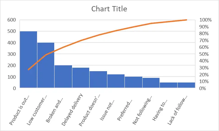
We can easily interpret a pareto chart in Excel because the left side of the vertical axis has “counts” or “costs” that depend on the data you are using. Each vertical bar represents the cumulative total percentage for the given issue.
As you can see on the graph, it is ordered by its rank from highest to lowest, and the bar on the left has the highest cumulative score.
When to use a Pareto chart?
A Pareto chart is mostly used to support decision-making by spotting some that have a lot of issues and focusing on the process of their improvement. It graphically represents the significance of different causes and effects of the situation.
In addition to that, it highlights all the factors in the data set that needed attention for improvement and illustrates the relative importance of each data set for the total.
How to make a pareto chart in Excel?
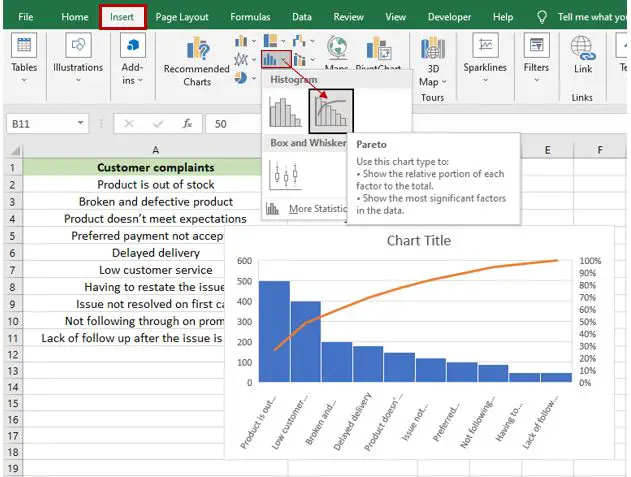
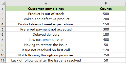
As you can see in the example below, we are going to do a Pareto chart of customer complaints in an online e-commerce application.
Time needed: 1 minute
This example with steps and a guide will teach you how to create a Pareto chart in Excel. Just execute the following steps:
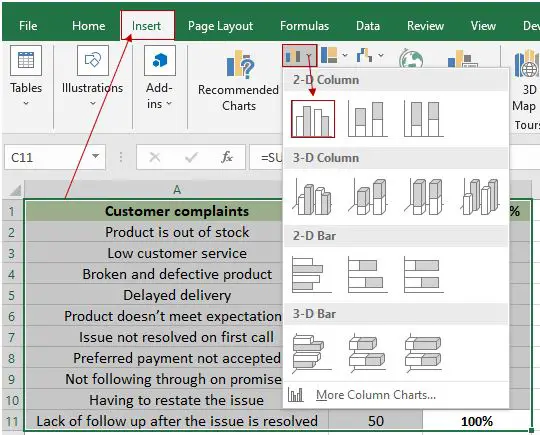
- Input your data in the Excel spreadsheet.

- Highlight the “customer complaints” and “counts” data sets. Click the “Insert” tab, then click “Insert Statistic Chart.” After that, select “Pareto” under “Histogram.” Excel will pick up the whole table automatically.

- The Pareto chart is automatically inserted into your worksheet, and you can change the title. This is the result of Pareto chart.

Formatting the Pareto Chart in Excel
This time you need to customize the Excel Pareto chart. Excel offers various settings to format your chart.
Follow the following instruction’s:
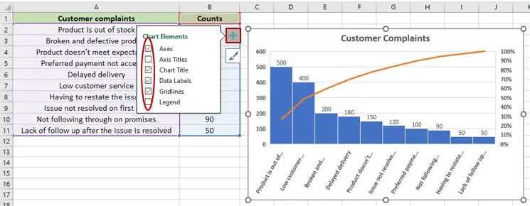
- Click the chart in order to see the two icons.
- Click the plus sign icon on the left side of the chart (in our case).
- Then, you can customize your chart; you can add the title, axis titles, data labels, and more, depending on what you want.
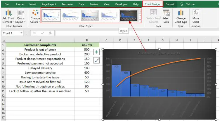
4. You can design your Pareto chart just like the image below. Click on your chart and select “Chart Design.” Right after that, you will see different designs, and you can explore and choose which design you would like to use.
How to create a Pareto chart in other versions of Excel?
This time, we will discuss how to create a Pareto chart in Excel with another version of Excel. You don’t have the most recent Excel versions? yet needed to create a Pareto chart.
This guide below is created so that you can still create one even though your Excel version is different. The only thing is that you have to give extra effort.
The reason is that older versions of MS Excel don’t have a built-in function for creating a Pareto chart.
Note: This formula can be used in all versions of Excel you have.
Now, let’s get started with the same data as we used in the example above.
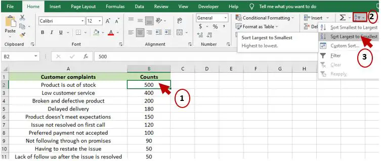
1. You need to sort the data in descending order.
2. Select any number in column B, and then select “Sort & Filter.” Select “Sort Largest to Smallest” in the drop-down list.
Your chart will look like in the image below.
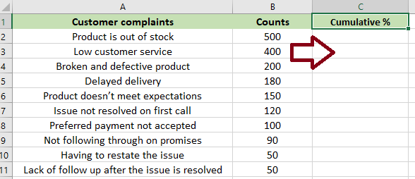
3. After you’ve sorted your data, you need to add another column for the cumulative percentages.
4. Once you added a cumulative column, you now need to calculate the cumulative percentage.
Here’s the formula: =SUM($B$2:B2)/SUM($B$2:$B$11)
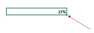
5. Enter the formula in the first cell (C2) shown below and drag the formula down.
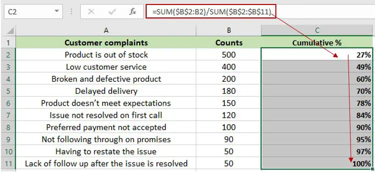
6. If you don’t know how to drag, refer to the image below. Just drag it down, and it will automatically get the cumulative percentages of each cell until C11.
Now that you have the cumulative percentage, it’s time to create a pareto chart. Let’s go!
7. Select all or highlight all the data, then click the “Insert” tab and click “Insert Column or Bar Chart.” It will display the list of columns and bars; choose “Clustered Column,” and it will automatically be added to your worksheet.
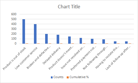
8. This is what it looks like; the cumulative percentage is not really visible because of its small value.
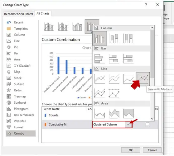
9. Click the bar chart, then right-click and select “Change Series Chart Type” in the context menu.
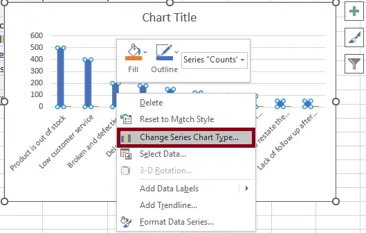
10. After you select “Change Series Chart Type,” it will display a “Change Chart Type” dialog box. Combo is selected by default. In the “Series name,” click the drop-down menu for “Cumulative %,” and then it will show a list; just choose “Line with Markers.”
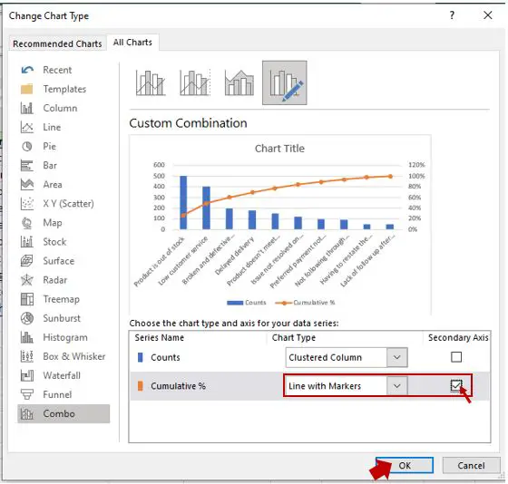
11. After you choose “Line with Markers,” check the secondary axis, and then click “OK.”
This is the result:
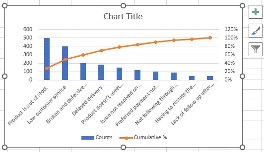
Now we are almost done, and at this moment we are going to customize our chart to make it closer to a histogram chart. As you can see, the cumulative percentage is up to 120%, but we only need 100%.
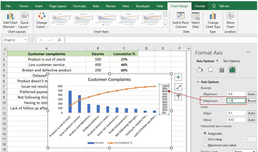
12. Double-click the cumulative percentage (0%–100%), and then the “Format Axis” pane will display. Under “Axis Options,” adjust the “Maximum” to (1.0).
Now, we need to change the gap of the clustered chart just like the histogram.
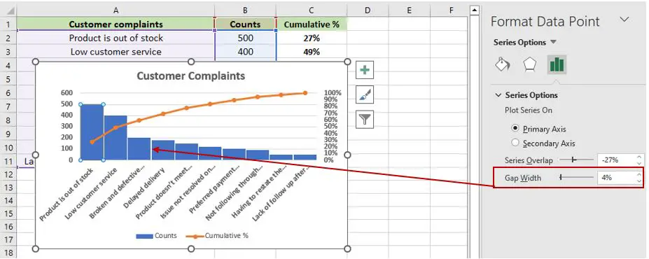
13. Double-click the blue bar chart, and then “Format Data Point” will display. In the “Format Data Point,” under “Series Options,” change the Gap Width to (4%).
Finally, we are done, and your chart should look like this:
Conclusion
In conclusion, this article will surely help you learn how to make a Pareto chart in Excel, of course in all versions of Excel. So, you can create one, though we are not in the same version of Excel.
With the help of this tutorial, you are now able to create a Pareto chart in Excel, and we are happy to know that you did great. We would love to hear some thoughts on this tutorial and how you’ve been using it.
Thank you very much for continuing to read until the end of this article. In case you have more questions, feel free to comment. You can also visit our website for additional information.